Symbology: Part Two

May 8, 2022

This is a follow up post to the original blog post. Go read it to learn the inspiration for the project.

View the new project page here.

A grid of squares, each an illustration of a symbol from the videogame Destiny

Over the last few years, there’s been a lot of discussion in the web and design community about “owning your content.” Partly a backlash to the corporate platform takeover, partly a desire to actually create something unique. There’s a definite nostalgia for the early days of the internet when websites were a beautiful haphazard journey around the world into someone’s domain.

Platforms are great for ease of use, but little did we know about the harvesting and selling of our data. Not to mention the straight up fuckery around monetizing hatred and sowing discord. Don’t get me wrong, I’m as guilty as the rest of you in creating accounts on the big platforms. When they first came online, it was a arms race of FOMO as I tried to secure my preferred user name and join the communities where I thought I needed to be seen. I think this all happened in a gray area between where browsers, dial-up, web hosting, HTML, CSS and Javascript were all a little stagnant and confusing. Somewhere between the pages filled with purple visited links and the shiny perfect user interfaces provided by gated communities. Of course, Adobe Flash filled the void for those more design or technically minded, but it was still difficult, expensive and therefore beyond the average user. So the platforms flourished and we all flocked leaving our sites stagnant.

Now it seems we’re all remembering what we left behind. Or at least, dusting off our blogs and creating projects just because we can. Just because we want to. I’ve never gone so far as to ignore this blog despite my post volume fluctuating with the ups and downs of life (this is my 300th post!), but I certainly left behind the creation of pages and sites that were simply fun exercises. I think I got stuck in the delusion that every project, every idea needed a unique domain name when in reality, it just needed a folder on my hard drive, a directory on my web server. Not every idea needs to be a financial success nor a financial burden. Frankly, it’s been liberating to remember that time when I was creating and putting all manner of weird and wonderful web pages online. I’ll probably have to dig through old hard drives to find some of those ideas, if only to reminisce.

I’m not sure I was actively considering all the above when I started with my latest projects. I think it may have been that they didn’t fit into a traditional “blog post” nor did they fit into a “work portfolio”. Projects like creating a set of CSS colors based on a science fiction movie are hard to place. Same goes for creating a virtual bookcase. They’re really just for me, just for fun and no less valid than any other project! As an artist, it’s sometimes hard to remember the latter.

So how did we get back to this old symbology project?

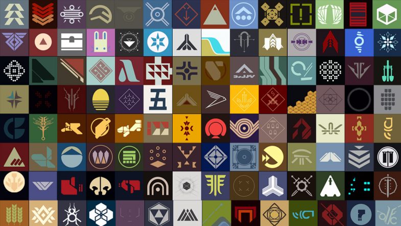
I came across this beautiful typography project by another designer (hosted on one of those corporate platforms) which was also inspired by the Destiny video game. This got me a bit nostalgic and I started looking back at all the symbols I had previously drawn. What I realized was that, despite the blog post about the project and even including a video of the symbols in the post, the entire thing was hosted on my Instagram account. And by virtue of the nature of the platform, the individual pieces were now buried in the feed. You’re not really able to see them all as a whole. (Not to mention the issues of copyright with Instagram and surveillance capitalism in general.)

Feeling a bit re-inspired, I’ve gone back, grabbed all (or most) of the original drawings, prepped them and built out a single page with the project. In terms of development, it’s all fairly basic HTML and CSS using the <figure> element to hold each image saved as an SVG file. I added a bit of flair by including the Destiny logo and a game background image for the hero. There’s CSS grid for the responsive layout and a little return to top button via a bit of Javascript (which I think I need to update to perform better). The hardest part of the whole thing was probably writing ALT text for each image — both from a volume perspective (118 images) as well as from a content perspective (it’s hard to describe a symbol from a science fiction story).

The project is now available to view as a complete set with the bonus of not having the UI distractions nor the advertising of Instagram. All in all, I think it’s a much better experience and I’m happy to have it all in one, self hosted place.

View the new project page here.

Blue Skull

January 29, 2022

A large spray painted graffiti of a blue skull

Still mining the archives as the pandemic keeps on going. Here’s a large piece from somewhere in Brooklyn. There’s some nice shading under the eye sockets. The attempt to add a devil lock of hair doesn’t quite work in terms of the perspective, but I still like it. This particular shade of blue isn’t one you see very often either.

Brooklyn, New York

Positivity

January 23, 2022

White cursive graffiti spraypaint of the phrase, "I like you!" on a green construction board

More unseen gems from the archive. This morning a bit of positivity with your typography. I can only imagine that it’s quite difficult to freehand write cursive this large — and to do it with a bit of style. Check the little serif connector on the letter “y”. Gorgeous. I also remember a bit of photographer’s conceit as I tried to line up the construction light with the exclamation point.

Manhattan, NYC

Glamour

January 16, 2022

A glamorous paste up graphic of a blonde woman wearing a bowler hat and old style tuxedo

Another piece from the deep archives. This is a closeup of a wheat pasted cut out printed on the bottom of a traffic pole. Beyond the glamour of the colors, there’s a distinct attitude in the position of her head and in her eyes. A wariness perhaps as she seems to be turning away but not looking away. Wearing men’s clothes but with red lipstick, she captures (demands?) the masculine without relinquishing the feminine.

Brooklyn, NYC

The Door

January 8, 2022

Red door with white spray paint pattern graffiti

Digging through the archives recently and I found this photo of a door from sometime in 2012. I love the minimal pattern, much of it single line, along with the loose flow of the lines. There’s a distinct improvised, on-the-spot feel to the piece.

Manhattan.

Ghost Dance

December 16, 2021

Spray paint graffiti of a smiling happy ghost skipping along in a single black line

Finally, made it back into the city and spotted this little gem. Confident line work with a great attitude and joy.

Soho, Manhattan.

War Sign

March 20, 2021

For a while now, as I’ve been working on symbols and icons, I’ve been thinking of opposites. The on/off icon switches we see throughout our digital lives. Am I on mute? Can you see my screen? These little yes/no binary icon changes to alert us in minuscule ways to our state of being. Each state is paired with it’s opposing force and we learn to recognize each as we build a library of shared acceptance. A common understanding if you will.

The concept of dualism as expressed by the yin and yang in ancient Chinese philosophy would say that each needs a counterpart in order to be whole. But there are symbols in our lives that do not seem to have an opposite and perhaps without both sides, we cannot have understanding. We’re only seeing one half of the picture.

This absence has always bugged me in particular around one symbol — the peace symbol. Now my annoyance probably has more to do with my nihilism and personal experiences than anything else. But coupled with a tendency to be a videogame completionist and being a designer, every time I see a peace sign, I wonder, where’s the war sign? Where’s the sign for those of us who see the dark?

Learning more about the origins of the peace symbol — probably via 99 Percent Invisible — finally gave me the push to create an opposing icon, a war sign to provide balance. Using the same flag semaphore base as the original, I’ve created a war sign.

war sign

The original peace sign uses the semaphore “N” and “D” for “nuclear disarmament” while this war sign uses the “N” and “W” for “nuclear war.” A grim thought, I know.

The peace sign was designed to express an element of despair while this war sign definitely has a more aggressive stance, even with the same “N” shape in place. Instead of drawing the eye down, it moves to the right and conjures an explosive element. It almost reminds me of the safety and hazard symbols used in science and transportation.

With the world at war for the last 20 years (or even longer depending on your framework) and the U.S. government continuing to keep the AUMF on the books so that it can declare war (without declaring war) any time it wants, we live in a time of war. Sadly, we need a symbol, a war sign. Perhaps with a symbol for both sides, we can gain an understanding of the whole and how each works in concert with the other.

Note: I’m certainly not promoting war. Don’t be silly. Quite the opposite in fact. I just think that denying war or keeping it invisible doesn’t work. Finally, despite a bit of intellectual meandering above, I’m realistic. This symbol will probably get used more by metal bands than anyone else. And I’m okay with that too.

You can download the war sign here.