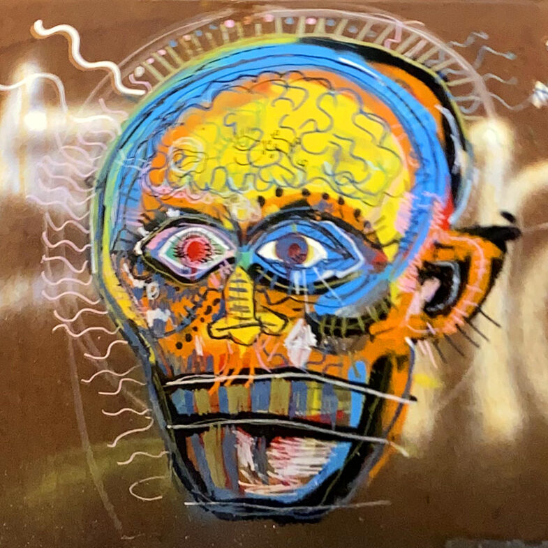
There’s a lot to unpack in this piece — loose brushwork, layer upon layer, a frantic somewhat anxious details and an unusual color palette. There’s a pulsing radiating energy to the brain and even the whole piece. I’m not even sure it’s by a single artist or just a various people adding to the mix. I snapped this photo In December, so perhaps it’s serving as a metaphor for the last year representing our collective dread. Let’s hope we can shake it off and regain a bit of our self health in 2023.
Found this little sticker outside the market and the lettering caught my eye. Definitely a practiced hand at work here — which makes sense if you’re going to go through all the expense of printing stickers. Practice, practice, practice before you print. I do wish the color wasn’t so faded. I bet the original blue was much more vibrant.
Over the last few years, there’s been a lot of discussion in the web and design community about “owning your content.” Partly a backlash to the corporate platform takeover, partly a desire to actually create something unique. There’s a definite nostalgia for the early days of the internet when websites were a beautiful haphazard journey around the world into someone’s domain.
Platforms are great for ease of use, but little did we know about the harvesting and selling of our data. Not to mention the straight up fuckery around monetizing hatred and sowing discord. Don’t get me wrong, I’m as guilty as the rest of you in creating accounts on the big platforms. When they first came online, it was a arms race of FOMO as I tried to secure my preferred user name and join the communities where I thought I needed to be seen. I think this all happened in a gray area between where browsers, dial-up, web hosting, HTML, CSS and Javascript were all a little stagnant and confusing. Somewhere between the pages filled with purple visited links and the shiny perfect user interfaces provided by gated communities. Of course, Adobe Flash filled the void for those more design or technically minded, but it was still difficult, expensive and therefore beyond the average user. So the platforms flourished and we all flocked leaving our sites stagnant.
Now it seems we’re all remembering what we left behind. Or at least, dusting off our blogs and creating projects just because we can. Just because we want to. I’ve never gone so far as to ignore this blog despite my post volume fluctuating with the ups and downs of life (this is my 300th post!), but I certainly left behind the creation of pages and sites that were simply fun exercises. I think I got stuck in the delusion that every project, every idea needed a unique domain name when in reality, it just needed a folder on my hard drive, a directory on my web server. Not every idea needs to be a financial success nor a financial burden. Frankly, it’s been liberating to remember that time when I was creating and putting all manner of weird and wonderful web pages online. I’ll probably have to dig through old hard drives to find some of those ideas, if only to reminisce.
I’m not sure I was actively considering all the above when I started with my latest projects. I think it may have been that they didn’t fit into a traditional “blog post” nor did they fit into a “work portfolio”. Projects like creating a set of CSS colors based on a science fiction movie are hard to place. Same goes for creating a virtual bookcase. They’re really just for me, just for fun and no less valid than any other project! As an artist, it’s sometimes hard to remember the latter.
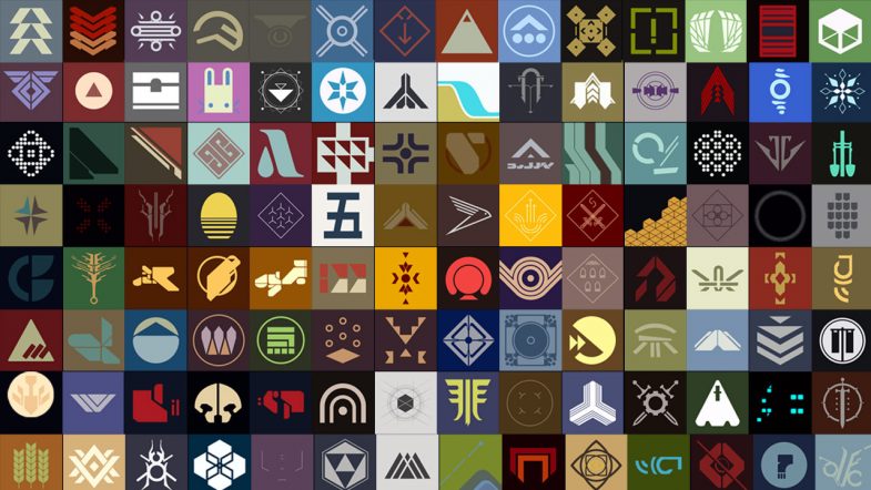
So how did we get back to this old symbology project?
I came across this beautiful typography project by another designer (hosted on one of those corporate platforms) which was also inspired by the Destiny video game. This got me a bit nostalgic and I started looking back at all the symbols I had previously drawn. What I realized was that, despite the blog post about the project and even including a video of the symbols in the post, the entire thing was hosted on my Instagram account. And by virtue of the nature of the platform, the individual pieces were now buried in the feed. You’re not really able to see them all as a whole. (Not to mention the issues of copyright with Instagram and surveillance capitalism in general.)
Feeling a bit re-inspired, I’ve gone back, grabbed all (or most) of the original drawings, prepped them and built out a single page with the project. In terms of development, it’s all fairly basic HTML and CSS using the <figure> element to hold each image saved as an SVG file. I added a bit of flair by including the Destiny logo and a game background image for the hero. There’s CSS grid for the responsive layout and a little return to top button via a bit of Javascript (which I think I need to update to perform better). The hardest part of the whole thing was probably writing ALT text for each image — both from a volume perspective (118 images) as well as from a content perspective (it’s hard to describe a symbol from a science fiction story).
The project is now available to view as a complete set with the bonus of not having the UI distractions nor the advertising of Instagram. All in all, I think it’s a much better experience and I’m happy to have it all in one, self hosted place.
Inspiration is a weird and wonderful thing. When it strikes, it generally locks in and will not let go. The idea keeps coming back around in my head and regardless of whether it fully comes to fruition, I have to chase after it.
Last week, I randomly came across a showing of the epic science fiction film, 2001: A Space Odyssey. As a science fiction fan and lover of the movie, I settled in to watch it again. Whenever you re-watch a movie, you’re bound to notice new things and this is especially true with a movie like this one where there is very little dialog and hardly any background music (apart from the classical pieces). There’s just so much open silence that you tend to focus in on other details.
What struck me most (again?) was the user interface screens used throughout the station, ship and pods. Now, the HAL 9000 is fairly established as a cultural reference and although the astronauts mostly interact with HAL via voice, it’s these UI screens that display information. The movie is such an epic force that it’s been dissected many times before by folks smarter than me so I won’t go into all the myriad details of things such as the typography. (Okay, maybe just a little bit of typography goodness later on.) The important thing I really focused on in this latest viewing was the color of the screens.
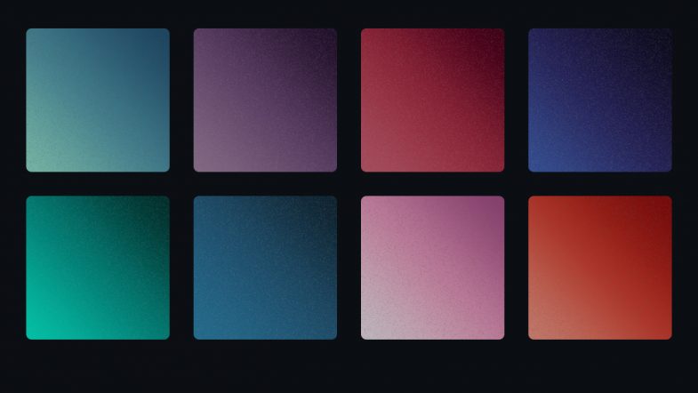
Each screen — and there are multiple displayed at a time — has a subtle, unique color gradient background. Reds, blues, purples, greens and grays. I’m not sure how the colors relate to the information or purpose, but there’s both a vibrancy and softness that I’m fascinated by. Part of it is probably the contradiction between the film trying to look futuristic while using 1960’s technology. Long before LCD screens, long before flat panel screens, long before high density displays, the film was attempting to predict what a user interface “screen” in a space ship would look like. And yet, it does an excellent job. The actor hairstyles feel more dated than the screens!
As I’ve mentioned, I’m a big fan of the movie, so over the decades I’ve always taken an interest in screen savers, desktop backgrounds and illustrations related to the movie. For me, HAL is a great foil for our modern relationship with our computers. Heck, my laptop crashed just today for no reason at all that I, as a mere human, can discern. All that was missing was HAL saying, “I can’t do that Dave.”
So with my interest in the movie art direction piqued once again, I was inspired to dig around find out more.
Concept
My idea was to recreate or capture those colors in a modern way, specifically in the way I’ve been focused on for work. I’ve been doing a ton of work on color for the web and with a bunch of new color models coming online soon, the way we see (and create) color on screen is going to change significantly. My idea was to use what I’ve been learning about CSS color to create a style sheet of color gradients to try to capture that magnificent soft glow of those science fiction screens.
Research
My initial research was driven by a memory. You know that thing where you remember seeing something online, but you can’t remember anything else? There should probably a new word for this phenomena. As I recall, there was a designer who created desktop backgrounds based on those screen colors. But…of course, I couldn’t remember or find anything in my searches.
The first project I did find — the HAL Project — is one of the old school originals. I do remember, the original screensaver as being tons of fun and using it at work always generated a ton of positive responses from scifi geeks. Looking it up again, it’s expanded into tons of materials which is awesome, although not quite what I was hoping for. Beautiful illustrations and typography, but flat color and more about detail than fidelity to the original.
Next I turned to a bunch of the UI and scifi blogs I love until I found the reference shots I was hoping for — actual screenshots from the movie itself. With these at hand, and finding nothing comparable to my idea, I was ready to try my hand at bringing these colors to CSS.
Process and Production
With references in hand, I began gathering pixel reference color samples to start building out the gradients. Starting with the basic HEX color space, I pulled three color samples for each screen: light, mid-range and dark. With those three values, I built out the initial gradients.
An aside on color and gradients
For years, creating gradients has always been difficult. Back in the day, creating a gradient in Photoshop or Illustrator was an effort in patience, often with poor visual results. Banding was a common problem leading the gradient to appear chunky instead of a smooth blend. A proliferation of tutorials featured various techniques and methods to achieve that holy grail of a beautiful seamless gradient.
Beyond the software, you also have differing color gamuts. Things that work in print, look horrible on screen (and vice versa). Even within each discipline, you have competing color models. Ask an experienced designer about color and you may get a long sigh. I still remember getting a “web design” from a print designer that used the completely wrong color space for the web. Every single color had to be converted and I had to explain why to the client.
Flash forward to today and you have multiple ways to write color values for the web. The long standing traditional methods of hex and RGB values are showing their limitations as new fancy monitors and screens are capable of displaying a wider range of colors. Gradients are an area where the RGB color space is showing its age leading to what some have called, the gray dead zone. Fixing this issue involves adding more stop points in the gradient and often times using a different color representation like HSL.
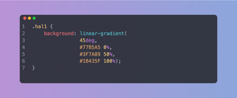
The idea was to set up unique CSS class names with a background attribute using a linear-gradient. Keeping it simple, the light color is set a 0%, the mid-range at 50% and the dark at 100%. Looking at the movie scenes, I settled on a direction of 45 degrees. I also set the class names as “hal” with a number in a nod to the movie.
Previewing them in the browser lead to multiple rounds of finesse to repeat this process to eliminate any banding and smooth out the gradients.
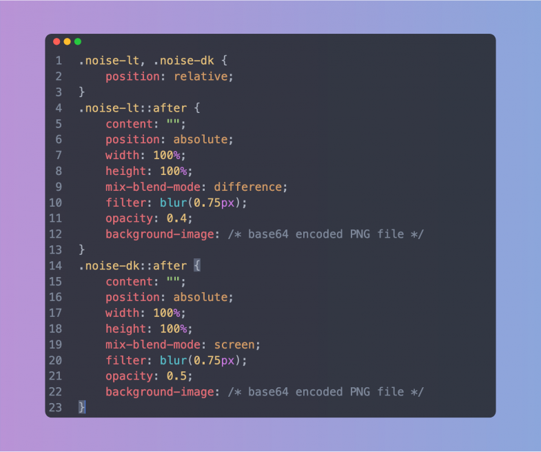
Something’s Not Quite Right
Getting the first few gradients smooth and looking good was great, but they also looked a bit too good. There was a lack of vintage to the colors. They somehow didn’t feel quite right. The solution was to create a couple of additional classes to add in some noise — just a touch to try to mimic the low resolution monitors used in the movie. The basic noise was created in Photoshop and exported as a small PNG tile. Since I wanted the final style sheet to stand on its on (and be ready to use), I ended up Base64 encoding the noise PNG file and dropping it into the CSS as a background image on a pseudo element of the class. It does make the CSS file significantly larger, but there’s no additional image file necessary (or to get lost). The noise was okay, but it still needed some finesse. Reducing the opacity, adding a bit of blur via a CSS filter and then setting a mix-blend-mode helped to make it more subtle. Of course, in dealing with blend modes, what works on a light color didn’t quite work on a dark color. This lead me to create two noise classes: one for dark gradients and one for light gradients, each with a different blend mode.
Different strokes, different folks
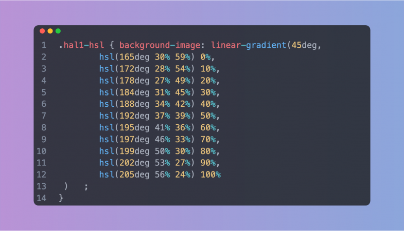
With both the basic RGB gradients and the optional noise additions in place, I began thinking about re-creating the set using HSL (hue, saturation, lightness) color values. Why? As mentioned in the aside above, different color modes along with additional color stops can help create a smoother, better looking gradient. In working with color and gradients, I’ve definitely seen some dramatic differences. Plus, it gives people the option to work with, and customize, the set that they like best. So how best to do this? Luckily, there’s some wonderful tools out there to help. I ended up using this tool with eight color stops in a straight linear curve. These new HSL gradients were added into the style sheet. Since I had spent so much time getting the RGB versions as smooth as possible, I didn’t see a tremendous difference with the new HSL values, but you can be the judge.
Putting it all together
With the gradients looking good, I started having fun with the page design to really capture the spirit of the movie. The gradient swatches were set up using CSS display:grid and setting the columns to repeat(auto-fill, minmax(200px, 1fr)). This fills the parent container with swatches as long as they are a minimum of 200 pixels wide. Short and sweet, automatic responsive behavior. The columns contract and stack as the screen gets smaller. I set a small border-radius on the swatches to help them mimic the shape of the monitors in the movie, added a bottom margin for spacing and the swatches were set. It was then just a matter of replicating each swatch <article> with the appropriate CSS class.
The colors for the rest of the page elements were also pulled from the movie stills. The page background, the type color, the button colors — all are from the movie — albeit adjusted a bit to make them more harmonious with the overall design. Nothing fancy with the color modes here, just the basic hex colors sampled from the stills.
The typography was another fun aspect. The type choice was never really a choice as the movie (and many other scifi films) uses Eurostile almost exclusively in the ship screens. I used the extended variant of the typeface and transformed everything to all caps using CSS. But once I had the type set up and the text in place, it still didn’t look right. Or to be more precise, it looked too right. It looked like a modern page. The text was sharp and crisp which didn’t reflect the time period or the technology used in the 1960s. The answer was to add a tiny bit of blur via the CSS filter:blur() property. This really brought the overall design to life. The whole thing really started to feel like a vintage CRT screen. It really is all about the subtle details to create the feel of a project.
Overall, I think it looks great and I’m happy with the final colors. Is it useful? Maybe not, but perhaps you’ve got a project where you need some nice gradients. Or perhaps, you’re just a scifi fan and this is a good reason to watch the film again. Either way, I’m glad I took the time to add to the movie’s legacy in some small way.
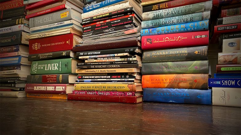
I love reading. Hence, I love books. All kinds from hardcover to audio to comic to magazine — I love them all. As a child, the library was one my favorite places to visit. I don’t think I’ve ever sold a book after acquiring. Ever. Really.
As you may imagine, this means I now have a lot of books. So many books. This wasn’t an issue when I lived in San Francisco and had a huge apartment. I filled it with book shelves and pilled in the books for display and easy access. But when I moved to New York, I knew that the tiny Manhattan apartment wouldn’t accommodate all the shelves or the books for that matter. The books went off into storage because I’d never willingly get rid of them and the shelves got sold, donated or recycled.
Flash forward and now I have a house with plenty of space. Almost immediately, I got all my books out of storage and moved them in. Unfortunately, I don’t have an shelves. Or at least, not nearly enough to hold all the books. Not even close.
So what’s a bibliophile to do? Well, as a temporary measure, I started by stacking them artistically around the fireplace. This was only okay. You can’t really grab a book like on a shelf. You can’t even really find a book. And when decorating a new house, piling stuff up doesn’t really scream “interior design”. It can work in some instances, but in my case, it was just…meh.
But if you’re a designer and developer as well as a bibliophile, you build a virtual book shelf on the web!
This was a great little project that let me play around with CSS grid techniques, design some new branding, work on my Javascript skills and look through all my books. I say “little” project as it naturally grew larger and larger to incorporate a bunch of little features and additions.
Inspiration
Initial design inspiration came from publisher sites like Thames & Hudson and Holloway as I knew I wanted a grid layout with good typography and minimal elements. On the development side, I was inspired by projects like Dave Rupert’s bookshelf albeit to a much less technical level.
Design
As I mentioned, it started out small and very much focused on the design. Typography was easy as I choose one of my favorite families, DIN, but getting the new color scheme right was more difficult. There was a lot of back and forth and experimentation to get the right balance of light tones while still maintaining enough contrast.
Basic content for each card was easy — title and author with a subtitle in some cases — but I also wanted to provide more organizational content as well. Hence adding the small text icons in the card footer to track with the filters in the navigation. As I was entering the info and building out the cards, I also started thinking about linking out for each book. Putting my UX hat on, I realized if I visited and found an interesting book, I’d love a link to find that book online. The hard part was then figuring out where to link to. I started out looking at the Library of Congress, but sadly found the site super confusing. For the comics and audio books, it was much easier. I found a comic price guide site that had a good search, cover images and details. This made it so I didn’t have to take my comics out of the protective plastic to figure out who the writer was. Audio books were also easy as we’re Audible subscribers, so our reading history is already in the system. I’m still a bit reluctant to link to Amazon proper for hardcover and paperbacks though. I’d rather link to a neutral site or a small independent bookshop. I put a pause on that for the moment, but it’s something I’m sure I’ll revisit. The Open Library project (linked below) seems to be the best option for the moment.
It’s worth noting that I did consider adding cover images to each card. In a few tests though, it really just added a level of chaos to the overall design. I was also worried about the performance impact. Hosting each cover image locally would be the way to go, but also presented a massive production challenge to gather and edit them all. Hot linking to a cover was an option via the Open Library, but again, adding the covers didn’t really match the card style. If the covers were the primary design element, I would have designed the cards entirely differently.
Development
Setting up the base CSS grid wasn’t too hard using repeat(auto-fill,minmax(320px,1fr)) to set up a “card” for each book in an <article> element. This also provided the built in responsive behavior so I didn’t have to use any media queries. Very nice.
The grid got a bit weirder though as I started setting up the interior of each card. I first dropped each book’s main info — title, subtitle and author — into a <cite> element to try to be as semantic as possible. The hard part was getting the categories indicators to sit at the bottom of each card. The key turned out to be using a grid on the container <div> for the details and using flex-end on the align-content property. I find things like this the most confusing part about CSS grid — layouts with columns within columns. I’m guessing the new subgrid specification will help with this once it becomes widely available.
It’s worth noting that there wasn’t any consideration on the volume of books or how best to store the data. I just picked up the closest book and entered the information directly into the HTML. The limitations of this approach, while somewhat romantic in it’s old school “let’s not complicate things” way, definitely became more apparent as the amount of books grew and grew. Still, being just text, the HTML file is still less than 500kb which isn’t unruly. If I were to start over. I’d probably drop all the book data into a JSON file to reference. Maybe in a future update I’ll tackle moving the data over to an external file and set up some sort of update interface form.
Organization: A shelf is not a library
While I started this project thinking of it as a “bookshelf”, the more I dug into the details, the more I realized I needed to add in extra information to make it actually valuable. Specifically, categorizing each book type really helps people (and myself) explore the page. So what was initially a bookshelf morphed into what is really a library. Categorization and nomenclature inevitably raises more questions that define the context. Is a graphic novel also a comic book? What about when I have both a paperback and the audio book version? Do I tag the book with both? Tackling each of these questions slowed down the progress a bit.
With general book categories set out, the next step was to create a filtering system and to show/hide the books based on the selection. This wasn’t too hard as they’re were multiple ways to handle it. I choose defining the categories as CSS class names, but I easily could have used data attributes as well. Technically, I’m not sure using empty CSS class names is an appropriate data strategy — as there’s no real styling at all — but it was less verbose than data attributes. I’ve been using data attributes more and more with other projects recently, so maybe I’ll go back and switch everything up in a future update. Seems like they’ll go nicely with the switch to a JSON file.
The filtering script set a CSS “show” class to each card on page load. The show class sets the display property to grid and the opacity to one. Without the show class, the display property is set to none. Of course, we can’t animate the display property, so the effect is a bit of a snap. I included the opacity change as a bit of wishful thinking. Perhaps in the future we’ll be able to animate the display property. At the same time, we also change the active state of the filter button to indicate which filter is in use. This basically just applies a set of new CSS rules to the active button.
Another organizational challenge came as the amount of books grew and grew. Since this project really started as a design challenge with just a few books, I never gave any thought to what it would look like with hundreds of books. Or how it would perform. I was just adding books while watching television or while drinking coffee in the mornings. There was no order at all. Thinking alphabetical by title was a safe way to initially list the books, I grabbed a little script to reorganize them on page load. From there I grabbed the source code from the browser and dropped it into the HTML file. From that point, I used the newly alphabetized list as the master file.
The filters were great, but still left a ton of books in any category. A viewer didn’t have much hope of finding a particular book or author. It was clear that a search option of some sort was necessary. This was easier said than done and I struggled with various implementations. Early attempts had two search forms — one for authors and another for titles. Each triggered on the keyup event without a submit button, but never seemed to work properly. Or rather, it worked occasionally. Sometimes the search conflicted with the filter buttons. Other times, it didn’t find a book on the page. I was never able to really figure out what was causing the errors and put it on hold and focused instead on adding more books.
Luckily, putting down a project is often (always?) the best way to gain the necessary perspective. Happens all the time with design and when I approached the idea of a search function again months later, I was able to get it running with a new form and implementation. This time around I used a single search field and a full page text search rather then trying to scope it to just the title or author content. As mentioned, the search is triggered on keyup which means we don’t need a submit button although I’m not sure I’ve covered off on all the accessibility features with this approach. It’ll need to be revisited with some more testing. One cool thing I read (somewhere, sorry!) was to add in a bit of a delay between the keyup and returning the search results. It makes it a bit less jarring and therefore, somewhat more human.
Of course there is
Now, I was never under any illusion that creating this was a unique idea, but it wasn’t until I was deep into the project that I found a bunch of other full fledged library software options. At which point, I was tempted to give up and see about using one of them. Sure, it would mean putting aside a lot of work, but in theory, a more robust application would provide me with a lot more options in terms of cataloging, updating and maintenance. Plus, creating a custom theme or template for an application is something I’m well versed in doing.
Readerware was the first I found, but it seemed a bit clunky. Yes, I’m being judgemental about the look and feel of the site, but it felt dated somehow. It also appears to be more general — including music and video cataloging — which I wasn’t really interested in. Plus, cost.
BookWyrm was the second I found, and while I applaud it’s decentralized, anti-corporate stance, I wasn’t looking for a social community. The docs even mention that cataloging is a secondary feature and not it’s primary role.
BookStack was the third and best of the apps I found. Free, open source, self hosted and it looks like a great wiki option. Finding it definitely made me throw up my hands and consider scrapping the entire project. The only thing that prevented me from giving it a spin was the hassle of dealing with the server install stuff.
Curation and honesty
One thing I tried hard to avoid was censoring myself. Fifty years of collecting books, sometimes from blind auctions, leaves one with some very odd titles. Even though I sometimes cringed as I found certain titles, I wanted to be honest. Honest as a librarian. It can be hard not to judge your younger self, but I wanted to showcase all the books — all the wild, weird and wonderful titles I’ve read over the years. So there’s some real oddballs in there if you dig in deep enough. I’ve always said “ignorance kills” and didn’t want to abandon that principle just to salve my ego from a bit of embarrassment. Perhaps the answer you’re looking for is in the collection.
Still mining the archives as the pandemic keeps on going. Here’s a large piece from somewhere in Brooklyn. There’s some nice shading under the eye sockets. The attempt to add a devil lock of hair doesn’t quite work in terms of the perspective, but I still like it. This particular shade of blue isn’t one you see very often either.
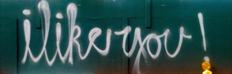
More unseen gems from the archive. This morning a bit of positivity with your typography. I can only imagine that it’s quite difficult to freehand write cursive this large — and to do it with a bit of style. Check the little serif connector on the letter “y”. Gorgeous. I also remember a bit of photographer’s conceit as I tried to line up the construction light with the exclamation point.