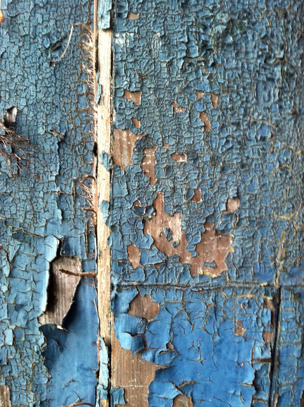
Free Textures: Peeling Paint
January 26, 2013
January 26, 2013
December 22, 2012

Brooklyn, NYC
October 28, 2012
Beyond the amazing first hand accounts of the immigrants who passed through Ellis Island as they entered America, the prints and posters from the era are a treasure trove of wonderful design and typography. Here’s a sampling (although the photos don’t do them justice).
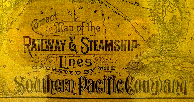
Fantastic typography detail from a Southern Pacific rail map. Note how it was important to include “correct” in the title.
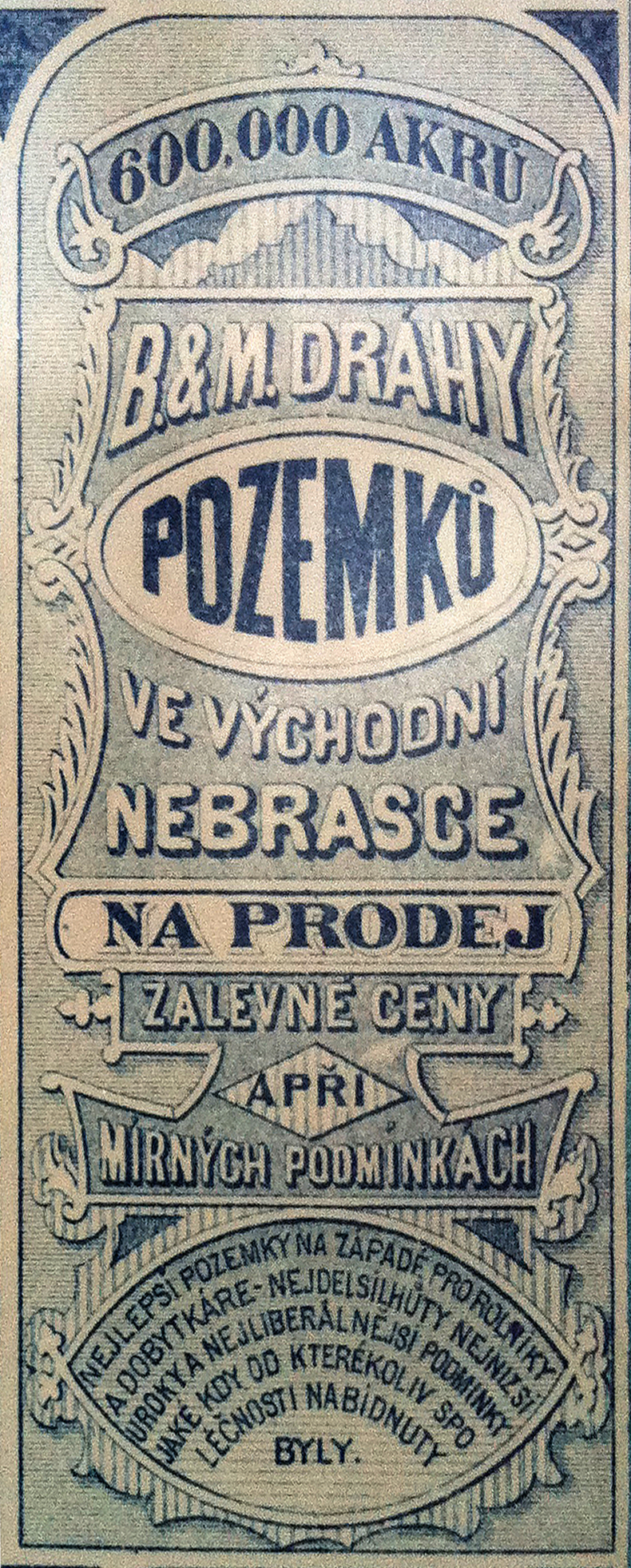
Detail of the typography from a rail poster advertising land.
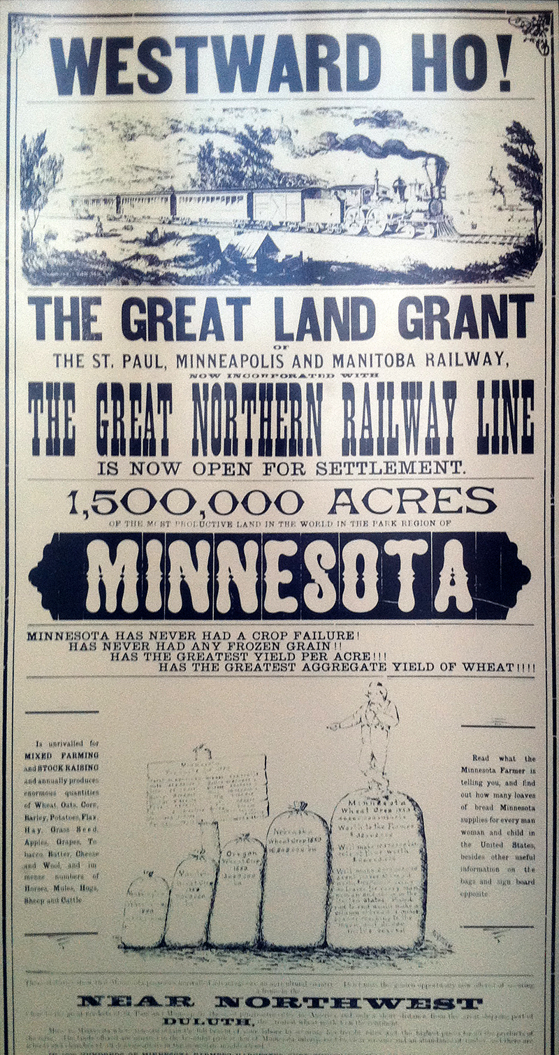
Poster advertising land in Minnesota. Note the wide variety of typefaces used — not uncommon for the time period. Serifs, sans-serifs, stylized display faces, heavily condensed faces and even extra wide faces at the bottom. Also note the odd kerning in the phrase, “The Great Land Grant”. It might just be the typeface itself as the “GR” letter combo looks weird.
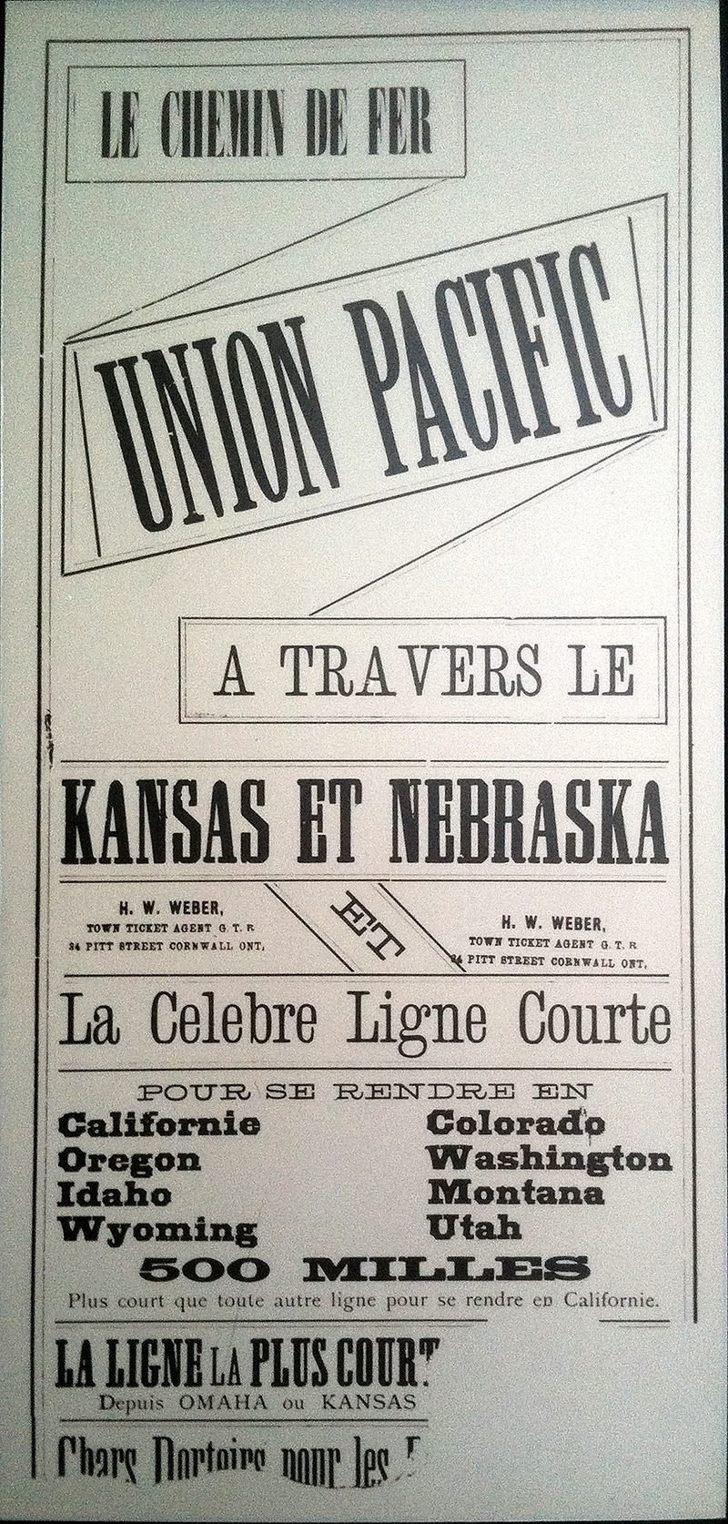
Another land grant poster — this time in French. The design of the top half really struck me as innovative and unique. The typography also takes a different track than many of the others using a thin slab serif face liberally and more classic serifs throughout. Note the poor kerning between the “A” and “V” in the word “travers”. It also looks like the poster was run once and then either stamped or re-printed with the agent’s name and info — the type block on the right is misaligned.
March 28, 2012

Red Hook, Brooklyn, NYC
March 3, 2012

South Brooklyn, NYC
October 23, 2011

The coolest punctuation mark in the alphabet as a stencil in black spray paint. With very nice curves too. South Brooklyn.
September 25, 2011
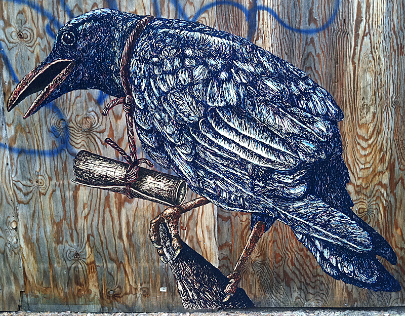
Huge, heavily detailed illustration wheat pasted up on construction site wall panels. Awesome concept with incredible execution. South Brooklyn.