Altered Meaning
June 11, 2011
If there’s one thing I love, it’s history. For me, understanding history helps me feel grounded in the present and part of the larger picture as a whole. Now, I’ve also been known to stop by a bar now and again. Combine the two and it’s pretty hard for me to resist. Couple these two with a unique story of typography and I’m a moth to the flame.
In New York, there’s no shortage of history and as you might imagine, there’s no shortage of historic bars. Some I’ve been to, some are still on my list. This is about one historic bar that also has a little typographic novelty.
New Yorker’s are resilient (as you might imagine) and have always been that way. The Ear Inn was built in 1817. The long and sordid tale of it’s decades as an unnamed sailor’s haunt perched on the edge of the Hudson River are better left for other times and better historians, but I do want to talk about it’s sign.
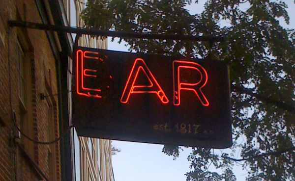
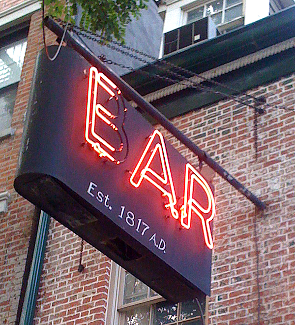
It’s sign, you see, is magnificent. It exemplifies both the resilient nature of New Yorkers and a wonderful grasp of typography.
In 1977 when new owners took over the bar, they were faced with two problems. The first? They had to actually name the bar. You see, it had mostly just been known as “bar” or “the Green Door” by the old sailors. And the second? The Landmark Commission. That’s one of the downsides of being historic. You’re protected from the vagaries of progress and as part of the deal you have to remain, well, historic. The Ear Inn had for many many years simply had a neon sign out front stating plainly, “bar”. Removing or replacing the sign would mean going before the Landmark Commission which in it’s infinite wisdom works at a glacial pace.
As for the name, they decided to name it after the music magazine that inhabited the second floor. As for the sign, this is where the story gets creative. The solution? Just paint over the parts of the “B” in bar to create a sign that reads, “Ear”. True inspiration. Not many folks (outside of those who love typography) would look at the letter “B” and see the “E” hiding inside.
Of course, the Ear Inn can’t avoid progress completely – last time I visited, I spoke with a couple of old timers over some whiskey who were lamenting the fact that many of the regulars were dying off. They were worried not only about their friends and their own future, but what would become of the Ear Inn. A new condo has been built next door (which might help keep the Ear Inn standing upright) and the neighborhood is being gentrified.