Rainstorm
July 20, 2011

July 20, 2011

June 11, 2011
If there’s one thing I love, it’s history. For me, understanding history helps me feel grounded in the present and part of the larger picture as a whole. Now, I’ve also been known to stop by a bar now and again. Combine the two and it’s pretty hard for me to resist. Couple these two with a unique story of typography and I’m a moth to the flame.
In New York, there’s no shortage of history and as you might imagine, there’s no shortage of historic bars. Some I’ve been to, some are still on my list. This is about one historic bar that also has a little typographic novelty.
New Yorker’s are resilient (as you might imagine) and have always been that way. The Ear Inn was built in 1817. The long and sordid tale of it’s decades as an unnamed sailor’s haunt perched on the edge of the Hudson River are better left for other times and better historians, but I do want to talk about it’s sign.
It’s sign, you see, is magnificent. It exemplifies both the resilient nature of New Yorkers and a wonderful grasp of typography.
In 1977 when new owners took over the bar, they were faced with two problems. The first? They had to actually name the bar. You see, it had mostly just been known as “bar” or “the Green Door” by the old sailors. And the second? The Landmark Commission. That’s one of the downsides of being historic. You’re protected from the vagaries of progress and as part of the deal you have to remain, well, historic. The Ear Inn had for many many years simply had a neon sign out front stating plainly, “bar”. Removing or replacing the sign would mean going before the Landmark Commission which in it’s infinite wisdom works at a glacial pace.
As for the name, they decided to name it after the music magazine that inhabited the second floor. As for the sign, this is where the story gets creative. The solution? Just paint over the parts of the “B” in bar to create a sign that reads, “Ear”. True inspiration. Not many folks (outside of those who love typography) would look at the letter “B” and see the “E” hiding inside.
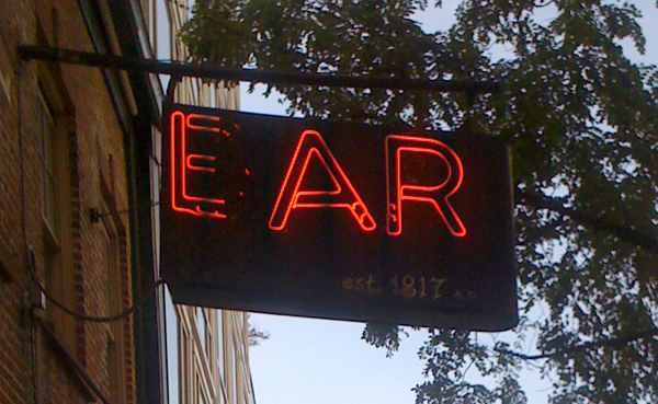
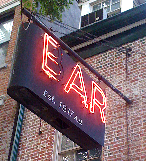
Of course, the Ear Inn can’t avoid progress completely – last time I visited, I spoke with a couple of old timers over some whiskey who were lamenting the fact that many of the regulars were dying off. They were worried not only about their friends and their own future, but what would become of the Ear Inn. A new condo has been built next door (which might help keep the Ear Inn standing upright) and the neighborhood is being gentrified.
January 30, 2011
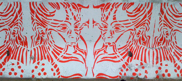
Found: Brooklyn, Near Piers, November 2010
January 26, 2011

I saw this the other day and despite walking by it all the time, the absurdity finally struck me.
It’s one thing to misplace the period on an abbreviation. It’s another to do it twice.
And the odds of doing it twice made me think of two things:
In the first case, the writer is choosing style over meaning — a mistake in most cases and especially when working in signage.
In the second case, I just think you should double and triple check something before you write it two feet high on the side of building. But heck, that’s just the designer in me.
November 21, 2010

Found: Manhattan, Upper West Side, October 2010
September 23, 2010
One of the earliest forms of graphic design in my mind is cartography. An elegant production of visual communication that has been refining itself since the dawn of man. Yeah, I like maps.
This past spring here in New York City, the MTA unveiled a new subway map, the first update of the map since 1998. And while the map has been reviewed in the press, as a designer, map lover and most importantly as a rider, I wanted to give my thoughts.

The old subway map suffered from an overwhelming amount of information some of which was really unnecessary for most riders. For example, the bus information always was an annoyance to me. It’s always just served as clutter the map.

One striking thing about the new map is the decision to reduce the size of Staten Island in relation to the other boroughs. This allows the other boroughs — where most of the trains (and people) are — to be enlarged. Apparently, there was some uproar about this decision, but personally, I’m fine with it. Guess what? I’ve lived here six years and never met anyone from Staten Island. All the other boroughs? Yep, lots of people, lots of times. In fact, I’ve never even been out to Staten Island. Maybe someday I’ll go, but I’ll probably take the ferry. Reducing it’s prominence on the map — even if the geographic proportions are not accurate — is a good design decision.
A large portion of the distracting bus route information has also been removed which I whole-heartedly approve of. It allows the map to focus on it’s main goal — the subway system.
One thing I don’t like about the new map is the color change for the parks. They’re no longer a true green and are much more subtle than in the previous map. The colors of the parks and the surrounding city are so similar as to make the parks almost unnoticeable. While I like maps, I also like parks and since many of the viewers of this map are tourists, I would think the city would want to highlight the green spaces.
——————–
Update: I’ve noticed that the version of the new map that actually is posted in subway cars contains even less of the pop out bus information boxes making for a cleaner (and clearer) presentation.
September 16, 2010
I dug up this old advertising pamphlet in my mother’s basement and beyond the New York City connection, I was inspired by the retro artwork of 1960’s advertising (not to mention the cocktail culture which it was a part of).

A few other interesting notes:
Stay tuned for more 1960’s advertising dug up from my mother’s basement.