From Screen to CSS
March 27, 2022
Creating CSS Gradients of the UI Screens in the movie 2001: A Space Odyssey
View the gallery and download the style sheet
Inspiration is a weird and wonderful thing. When it strikes, it generally locks in and will not let go. The idea keeps coming back around in my head and regardless of whether it fully comes to fruition, I have to chase after it.
Last week, I randomly came across a showing of the epic science fiction film, 2001: A Space Odyssey. As a science fiction fan and lover of the movie, I settled in to watch it again. Whenever you re-watch a movie, you’re bound to notice new things and this is especially true with a movie like this one where there is very little dialog and hardly any background music (apart from the classical pieces). There’s just so much open silence that you tend to focus in on other details.
What struck me most (again?) was the user interface screens used throughout the station, ship and pods. Now, the HAL 9000 is fairly established as a cultural reference and although the astronauts mostly interact with HAL via voice, it’s these UI screens that display information. The movie is such an epic force that it’s been dissected many times before by folks smarter than me so I won’t go into all the myriad details of things such as the typography. (Okay, maybe just a little bit of typography goodness later on.) The important thing I really focused on in this latest viewing was the color of the screens.
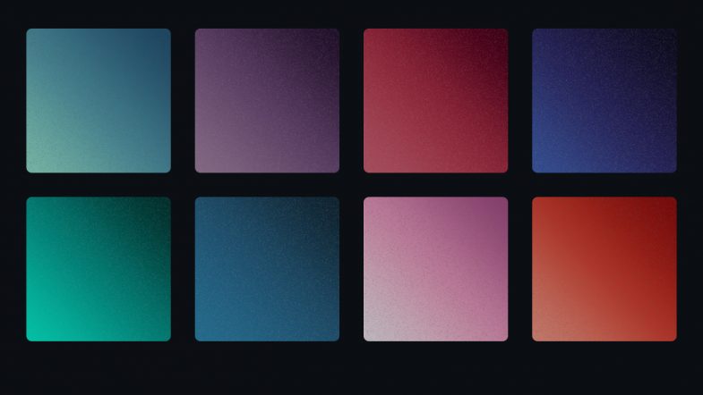
Each screen — and there are multiple displayed at a time — has a subtle, unique color gradient background. Reds, blues, purples, greens and grays. I’m not sure how the colors relate to the information or purpose, but there’s both a vibrancy and softness that I’m fascinated by. Part of it is probably the contradiction between the film trying to look futuristic while using 1960’s technology. Long before LCD screens, long before flat panel screens, long before high density displays, the film was attempting to predict what a user interface “screen” in a space ship would look like. And yet, it does an excellent job. The actor hairstyles feel more dated than the screens!
As I’ve mentioned, I’m a big fan of the movie, so over the decades I’ve always taken an interest in screen savers, desktop backgrounds and illustrations related to the movie. For me, HAL is a great foil for our modern relationship with our computers. Heck, my laptop crashed just today for no reason at all that I, as a mere human, can discern. All that was missing was HAL saying, “I can’t do that Dave.”
So with my interest in the movie art direction piqued once again, I was inspired to dig around find out more.
Concept
My idea was to recreate or capture those colors in a modern way, specifically in the way I’ve been focused on for work. I’ve been doing a ton of work on color for the web and with a bunch of new color models coming online soon, the way we see (and create) color on screen is going to change significantly. My idea was to use what I’ve been learning about CSS color to create a style sheet of color gradients to try to capture that magnificent soft glow of those science fiction screens.
Research
My initial research was driven by a memory. You know that thing where you remember seeing something online, but you can’t remember anything else? There should probably a new word for this phenomena. As I recall, there was a designer who created desktop backgrounds based on those screen colors. But…of course, I couldn’t remember or find anything in my searches.
The first project I did find — the HAL Project — is one of the old school originals. I do remember, the original screensaver as being tons of fun and using it at work always generated a ton of positive responses from scifi geeks. Looking it up again, it’s expanded into tons of materials which is awesome, although not quite what I was hoping for. Beautiful illustrations and typography, but flat color and more about detail than fidelity to the original.
Next I turned to a bunch of the UI and scifi blogs I love until I found the reference shots I was hoping for — actual screenshots from the movie itself. With these at hand, and finding nothing comparable to my idea, I was ready to try my hand at bringing these colors to CSS.
Process and Production
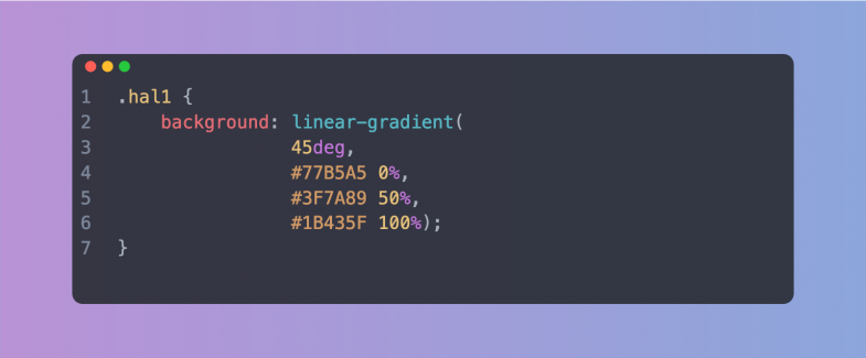
With references in hand, I began gathering pixel reference color samples to start building out the gradients. Starting with the basic HEX color space, I pulled three color samples for each screen: light, mid-range and dark. With those three values, I built out the initial gradients.
An aside on color and gradients
For years, creating gradients has always been difficult. Back in the day, creating a gradient in Photoshop or Illustrator was an effort in patience, often with poor visual results. Banding was a common problem leading the gradient to appear chunky instead of a smooth blend. A proliferation of tutorials featured various techniques and methods to achieve that holy grail of a beautiful seamless gradient.
Beyond the software, you also have differing color gamuts. Things that work in print, look horrible on screen (and vice versa). Even within each discipline, you have competing color models. Ask an experienced designer about color and you may get a long sigh. I still remember getting a “web design” from a print designer that used the completely wrong color space for the web. Every single color had to be converted and I had to explain why to the client.
Flash forward to today and you have multiple ways to write color values for the web. The long standing traditional methods of hex and RGB values are showing their limitations as new fancy monitors and screens are capable of displaying a wider range of colors. Gradients are an area where the RGB color space is showing its age leading to what some have called, the gray dead zone. Fixing this issue involves adding more stop points in the gradient and often times using a different color representation like HSL.
The idea was to set up unique CSS class names with a background attribute using a linear-gradient. Keeping it simple, the light color is set a 0%, the mid-range at 50% and the dark at 100%. Looking at the movie scenes, I settled on a direction of 45 degrees. I also set the class names as “hal” with a number in a nod to the movie.
Previewing them in the browser lead to multiple rounds of finesse to repeat this process to eliminate any banding and smooth out the gradients.
Something’s Not Quite Right
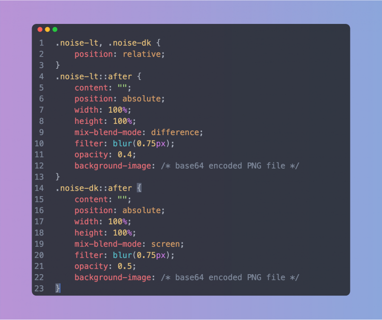
Getting the first few gradients smooth and looking good was great, but they also looked a bit too good. There was a lack of vintage to the colors. They somehow didn’t feel quite right. The solution was to create a couple of additional classes to add in some noise — just a touch to try to mimic the low resolution monitors used in the movie. The basic noise was created in Photoshop and exported as a small PNG tile. Since I wanted the final style sheet to stand on its on (and be ready to use), I ended up Base64 encoding the noise PNG file and dropping it into the CSS as a background image on a pseudo element of the class. It does make the CSS file significantly larger, but there’s no additional image file necessary (or to get lost). The noise was okay, but it still needed some finesse. Reducing the opacity, adding a bit of blur via a CSS filter and then setting a mix-blend-mode helped to make it more subtle. Of course, in dealing with blend modes, what works on a light color didn’t quite work on a dark color. This lead me to create two noise classes: one for dark gradients and one for light gradients, each with a different blend mode.
Different strokes, different folks
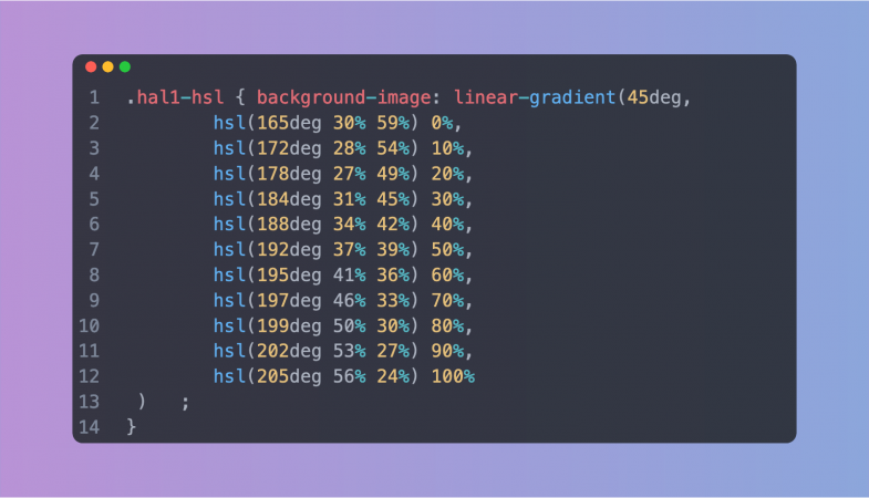
With both the basic RGB gradients and the optional noise additions in place, I began thinking about re-creating the set using HSL (hue, saturation, lightness) color values. Why? As mentioned in the aside above, different color modes along with additional color stops can help create a smoother, better looking gradient. In working with color and gradients, I’ve definitely seen some dramatic differences. Plus, it gives people the option to work with, and customize, the set that they like best. So how best to do this? Luckily, there’s some wonderful tools out there to help. I ended up using this tool with eight color stops in a straight linear curve. These new HSL gradients were added into the style sheet. Since I had spent so much time getting the RGB versions as smooth as possible, I didn’t see a tremendous difference with the new HSL values, but you can be the judge.
Putting it all together
With the gradients looking good, I started having fun with the page design to really capture the spirit of the movie. The gradient swatches were set up using CSS display:grid and setting the columns to repeat(auto-fill, minmax(200px, 1fr)). This fills the parent container with swatches as long as they are a minimum of 200 pixels wide. Short and sweet, automatic responsive behavior. The columns contract and stack as the screen gets smaller. I set a small border-radius on the swatches to help them mimic the shape of the monitors in the movie, added a bottom margin for spacing and the swatches were set. It was then just a matter of replicating each swatch <article> with the appropriate CSS class.
The colors for the rest of the page elements were also pulled from the movie stills. The page background, the type color, the button colors — all are from the movie — albeit adjusted a bit to make them more harmonious with the overall design. Nothing fancy with the color modes here, just the basic hex colors sampled from the stills.
The typography was another fun aspect. The type choice was never really a choice as the movie (and many other scifi films) uses Eurostile almost exclusively in the ship screens. I used the extended variant of the typeface and transformed everything to all caps using CSS. But once I had the type set up and the text in place, it still didn’t look right. Or to be more precise, it looked too right. It looked like a modern page. The text was sharp and crisp which didn’t reflect the time period or the technology used in the 1960s. The answer was to add a tiny bit of blur via the CSS filter:blur() property. This really brought the overall design to life. The whole thing really started to feel like a vintage CRT screen. It really is all about the subtle details to create the feel of a project.
Overall, I think it looks great and I’m happy with the final colors. Is it useful? Maybe not, but perhaps you’ve got a project where you need some nice gradients. Or perhaps, you’re just a scifi fan and this is a good reason to watch the film again. Either way, I’m glad I took the time to add to the movie’s legacy in some small way.