Tactile

August 9, 2026

A screenshot of a selection of web buttons styled to look and behave like physical buttons.

Recreating the joy of physical buttons

View the project

Sometimes you find a design that strikes a chord of wonder and nostalgia. As we race to put glossy, glassy touch screens on everything around us, there is a rising wave of desire for actual engineered mechanisms. Touch, it turns out, must also include a physicality in order for us, as humans, to be satisfied. Buttons, toggles, switches, knobs, levers, handles, pulls — all are designed to connect with our most basic and arguably most important tool, our hands.

Car manufacturers are reverting from touch interfaces to go back to physical buttons. People are building and customizing mechanical keyboards. Even the kids are feeling the nostalgia and the bite of monthly streaming subscription fees and going back to dedicated MP3 players with physical buttons.

One notable company who has been designing and building stylish products even before this latest nostalgia wave, is Teenage Engineering. I first came across them when they released the gorgeous TP-7 audio recorder, but alas, the price was…let’s say significant. You can see the physicality and intention in all their products. They want to be touched. You want to hold them in your hands and explore the surfaces and interactions.

When they launched the K.O. II sampler, I was immediately drawn in by all the buttons and knobs. The whole thing just draws you in with color and texture. It’s somehow a 1980s vintage calculator masquerading as an audio sampler. Even the gray base is reminiscent of the beige computers I grew up with. I was so enamored that, in an act of skeuomorphism, I decided to try to recreate the buttons for the web. As a side note, there is a fine line between too much mimicry and just enough. My goal was to try to capture that fine balance as designed by Teenage Engineering — a beautiful, tactile experience.

Design & Development

In dissecting the photo of the sampler, a few key details stand out. Namely, the shadows and the borders are really doing most of the work to create the different button states. In fact, since the we’re trying to mimic physical buttons, there is no :hover state at all. There are only a default and an :active state. For the active button state, the borders get darker and the shadow moves from outside to inside. To get the lighting right for the borders, the top and left borders use the same color to set a single light source hitting the buttons from the top left. The same, albeit reversed, is true for the bottom and right borders — they share the same color. The majority of the colors are set via CSS variables, but you can also see some colors using hard coded RGB values. This is just a case of me tweaking the exact shade and never going back to create a new variable. Working at the speed of lazy.

I also considered using a gradient for the border to have a more seamless edge around the corners. Since gradients are not supported for the border CSS property, it would mean using a extra container with a gradient fill and then a mask or clip-path to cut out the middle for the button surface. It’s certainly possible, but seemed like a heck of a lot of extra work (and code) for just a smoother corner color.

Part of what makes the button press depth work is a visual trick. The square background behind the rounded button serves as the “seat” of the button. It’s the space the physical button sits. Think about your keyboard and you’ll get the idea. The default or “raised” state has the button sitting higher via the outer shadow. The active or “pressed” state has the button sitting lower via the inset shadow. It gives the impression of a size change, but it’s all accomplished via the shadows and the darker container.

The HTML is quite simple as I wanted to make the buttons actually use the <button> element. These are meant for actions, not links.

The toggles are almost identical in the design. Toggles are just sticky buttons really. Instead of an active state, it’s just an “on” state. The big difference is that I’m using the checkbox hack in the HTML to create the effect. Using an <input type="checkbox"> with the appearance set to none allows us to style it like the other buttons. Instead of the button’s :active pseudo selector, the inputs use the :checkbox selector so we can target the “on” state and style it.

I’m not sure I got the colors and shadow depth quite right, but it does give the correct effect. You can feel the button press and it is quite satisfying.

The text for the buttons in mostly inline as part of the <button> element. The small text is set inline via a data-* attribute and then appended to the button by a :before pseudo class which is all very cool.

/* buttons with secondary text/symbols added */
<button class="btn shift" id="btnC" data-copy-shift="↑">C</button>
.btn.shift::before {
  content: attr(data-copy-shift) / "Shift icon";
}

/* toggles with small text alone */
<input class="toggle org" id="btnR" data-copy="Record" type="checkbox">
.toggle::before {
  content: attr(data-copy) / "Record";
}

I’m not sure if this data attribute is the most accessible thing to do as it kind of triggers the “don’t hide content” part of my brain, so be sure to do a more research if you want to use it in production. Speaking of testing, it’s worth noting that there will be code differences between the Codepen examples and the actual project page. Different systems, different goals and hence, different approaches. For example, on the toggles I’ve approached the text copy in two different ways. In the Codepen, I used the CSS content property to add the text with a :before pseudo-selector. On the project page, I’ve used data-* attributes to add the text copy and then added some extra HTML for accessibility. I’ve been enamored with data attributes at work, so that’s probably why I used them. Of course, I then doubted myself and went back into the Codepen to add in the <span> and aria-labelledby for the toggles which may be overkill (or just straight up broken).

I didn’t recreate the entire sampler as I was really focused on the buttons, but I did drop in some of the little lights which are fun. They’re activated with Javascript on the buttons to toggle a “on” CSS class changing the color and shadow. There are also some half height buttons, but I never got quite happy with the result. I think the border-radius on those corners needs to be smaller.

I’m also enamored with the unit’s speaker grid as it reminds me of all the (now retro) devices from my teenage years. Maybe I’ll recreate it for a future project as it seems like it could be a nice reusable pattern.

In the meantime, let’s go back to physical buttons and where we can, let’s make our web buttons cool too. Go ahead and fork the Codepen and start making some true button buttons for the web. Heck, even the bevel edge web 1.0 88×31 buttons are back in fashion (and might show up here as well some day).
View the project

Symbology: Part Two

May 8, 2022

This is a follow up post to the original blog post. Go read it to learn the inspiration for the project.

View the new project page here.

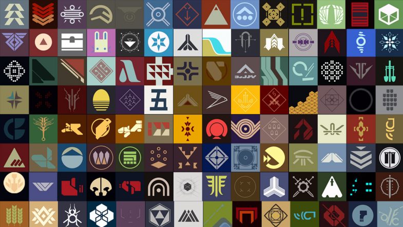
A grid of squares, each an illustration of a symbol from the videogame Destiny

Over the last few years, there’s been a lot of discussion in the web and design community about “owning your content.” Partly a backlash to the corporate platform takeover, partly a desire to actually create something unique. There’s a definite nostalgia for the early days of the internet when websites were a beautiful haphazard journey around the world into someone’s domain.

Platforms are great for ease of use, but little did we know about the harvesting and selling of our data. Not to mention the straight up fuckery around monetizing hatred and sowing discord. Don’t get me wrong, I’m as guilty as the rest of you in creating accounts on the big platforms. When they first came online, it was a arms race of FOMO as I tried to secure my preferred user name and join the communities where I thought I needed to be seen. I think this all happened in a gray area between where browsers, dial-up, web hosting, HTML, CSS and Javascript were all a little stagnant and confusing. Somewhere between the pages filled with purple visited links and the shiny perfect user interfaces provided by gated communities. Of course, Adobe Flash filled the void for those more design or technically minded, but it was still difficult, expensive and therefore beyond the average user. So the platforms flourished and we all flocked leaving our sites stagnant.

Now it seems we’re all remembering what we left behind. Or at least, dusting off our blogs and creating projects just because we can. Just because we want to. I’ve never gone so far as to ignore this blog despite my post volume fluctuating with the ups and downs of life (this is my 300th post!), but I certainly left behind the creation of pages and sites that were simply fun exercises. I think I got stuck in the delusion that every project, every idea needed a unique domain name when in reality, it just needed a folder on my hard drive, a directory on my web server. Not every idea needs to be a financial success nor a financial burden. Frankly, it’s been liberating to remember that time when I was creating and putting all manner of weird and wonderful web pages online. I’ll probably have to dig through old hard drives to find some of those ideas, if only to reminisce.

I’m not sure I was actively considering all the above when I started with my latest projects. I think it may have been that they didn’t fit into a traditional “blog post” nor did they fit into a “work portfolio”. Projects like creating a set of CSS colors based on a science fiction movie are hard to place. Same goes for creating a virtual bookcase. They’re really just for me, just for fun and no less valid than any other project! As an artist, it’s sometimes hard to remember the latter.

So how did we get back to this old symbology project?

I came across this beautiful typography project by another designer (hosted on one of those corporate platforms) which was also inspired by the Destiny video game. This got me a bit nostalgic and I started looking back at all the symbols I had previously drawn. What I realized was that, despite the blog post about the project and even including a video of the symbols in the post, the entire thing was hosted on my Instagram account. And by virtue of the nature of the platform, the individual pieces were now buried in the feed. You’re not really able to see them all as a whole. (Not to mention the issues of copyright with Instagram and surveillance capitalism in general.)

Feeling a bit re-inspired, I’ve gone back, grabbed all (or most) of the original drawings, prepped them and built out a single page with the project. In terms of development, it’s all fairly basic HTML and CSS using the <figure> element to hold each image saved as an SVG file. I added a bit of flair by including the Destiny logo and a game background image for the hero. There’s CSS grid for the responsive layout and a little return to top button via a bit of Javascript (which I think I need to update to perform better). The hardest part of the whole thing was probably writing ALT text for each image — both from a volume perspective (118 images) as well as from a content perspective (it’s hard to describe a symbol from a science fiction story).

The project is now available to view as a complete set with the bonus of not having the UI distractions nor the advertising of Instagram. All in all, I think it’s a much better experience and I’m happy to have it all in one, self hosted place.

View the new project page here.

From Screen to CSS

March 27, 2022

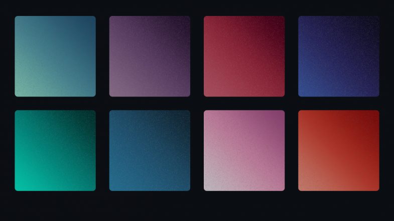
A sample of the UI color gradients from 2001 A Space Odessey

Creating CSS Gradients of the UI Screens in the movie 2001: A Space Odyssey

View the gallery and download the style sheet

Inspiration is a weird and wonderful thing. When it strikes, it generally locks in and will not let go. The idea keeps coming back around in my head and regardless of whether it fully comes to fruition, I have to chase after it.

Last week, I randomly came across a showing of the epic science fiction film, 2001: A Space Odyssey. As a science fiction fan and lover of the movie, I settled in to watch it again. Whenever you re-watch a movie, you’re bound to notice new things and this is especially true with a movie like this one where there is very little dialog and hardly any background music (apart from the classical pieces). There’s just so much open silence that you tend to focus in on other details.

What struck me most (again?) was the user interface screens used throughout the station, ship and pods. Now, the HAL 9000 is fairly established as a cultural reference and although the astronauts mostly interact with HAL via voice, it’s these UI screens that display information. The movie is such an epic force that it’s been dissected many times before by folks smarter than me so I won’t go into all the myriad details of things such as the typography. (Okay, maybe just a little bit of typography goodness later on.) The important thing I really focused on in this latest viewing was the color of the screens.

Each screen — and there are multiple displayed at a time — has a subtle, unique color gradient background. Reds, blues, purples, greens and grays. I’m not sure how the colors relate to the information or purpose, but there’s both a vibrancy and softness that I’m fascinated by. Part of it is probably the contradiction between the film trying to look futuristic while using 1960’s technology. Long before LCD screens, long before flat panel screens, long before high density displays, the film was attempting to predict what a user interface “screen” in a space ship would look like. And yet, it does an excellent job. The actor hairstyles feel more dated than the screens!

As I’ve mentioned, I’m a big fan of the movie, so over the decades I’ve always taken an interest in screen savers, desktop backgrounds and illustrations related to the movie. For me, HAL is a great foil for our modern relationship with our computers. Heck, my laptop crashed just today for no reason at all that I, as a mere human, can discern. All that was missing was HAL saying, “I can’t do that Dave.”

So with my interest in the movie art direction piqued once again, I was inspired to dig around find out more.

Concept

My idea was to recreate or capture those colors in a modern way, specifically in the way I’ve been focused on for work. I’ve been doing a ton of work on color for the web and with a bunch of new color models coming online soon, the way we see (and create) color on screen is going to change significantly. My idea was to use what I’ve been learning about CSS color to create a style sheet of color gradients to try to capture that magnificent soft glow of those science fiction screens.

Research

My initial research was driven by a memory. You know that thing where you remember seeing something online, but you can’t remember anything else? There should probably a new word for this phenomena. As I recall, there was a designer who created desktop backgrounds based on those screen colors. But…of course, I couldn’t remember or find anything in my searches.

The first project I did find — the HAL Project — is one of the old school originals. I do remember, the original screensaver as being tons of fun and using it at work always generated a ton of positive responses from scifi geeks. Looking it up again, it’s expanded into tons of materials which is awesome, although not quite what I was hoping for. Beautiful illustrations and typography, but flat color and more about detail than fidelity to the original.

Next I turned to a bunch of the UI and scifi blogs I love until I found the reference shots I was hoping for — actual screenshots from the movie itself. With these at hand, and finding nothing comparable to my idea, I was ready to try my hand at bringing these colors to CSS.

Process and Production

With references in hand, I began gathering pixel reference color samples to start building out the gradients. Starting with the basic HEX color space, I pulled three color samples for each screen: light, mid-range and dark. With those three values, I built out the initial gradients.


An aside on color and gradients

For years, creating gradients has always been difficult. Back in the day, creating a gradient in Photoshop or Illustrator was an effort in patience, often with poor visual results. Banding was a common problem leading the gradient to appear chunky instead of a smooth blend. A proliferation of tutorials featured various techniques and methods to achieve that holy grail of a beautiful seamless gradient.

Beyond the software, you also have differing color gamuts. Things that work in print, look horrible on screen (and vice versa). Even within each discipline, you have competing color models. Ask an experienced designer about color and you may get a long sigh. I still remember getting a “web design” from a print designer that used the completely wrong color space for the web. Every single color had to be converted and I had to explain why to the client.

Flash forward to today and you have multiple ways to write color values for the web. The long standing traditional methods of hex and RGB values are showing their limitations as new fancy monitors and screens are capable of displaying a wider range of colors. Gradients are an area where the RGB color space is showing its age leading to what some have called, the gray dead zone. Fixing this issue involves adding more stop points in the gradient and often times using a different color representation like HSL.


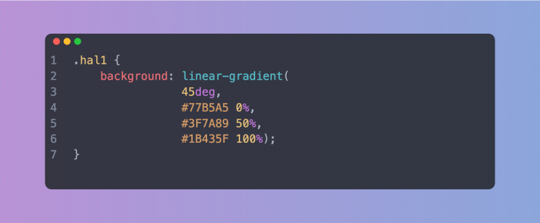
The idea was to set up unique CSS class names with a background attribute using a linear-gradient. Keeping it simple, the light color is set a 0%, the mid-range at 50% and the dark at 100%. Looking at the movie scenes, I settled on a direction of 45 degrees. I also set the class names as “hal” with a number in a nod to the movie.

Code sample showing the basic CSS class name and background linear gradient

Previewing them in the browser lead to multiple rounds of finesse to repeat this process to eliminate any banding and smooth out the gradients.

Something’s Not Quite Right

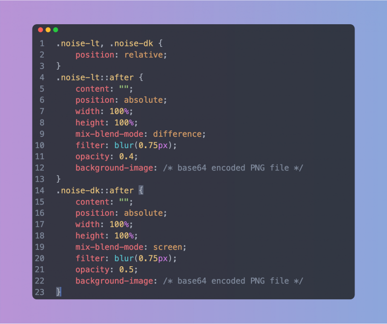
Getting the first few gradients smooth and looking good was great, but they also looked a bit too good. There was a lack of vintage to the colors. They somehow didn’t feel quite right. The solution was to create a couple of additional classes to add in some noise — just a touch to try to mimic the low resolution monitors used in the movie. The basic noise was created in Photoshop and exported as a small PNG tile. Since I wanted the final style sheet to stand on its on (and be ready to use), I ended up Base64 encoding the noise PNG file and dropping it into the CSS as a background image on a pseudo element of the class. It does make the CSS file significantly larger, but there’s no additional image file necessary (or to get lost). The noise was okay, but it still needed some finesse. Reducing the opacity, adding a bit of blur via a CSS filter and then setting a mix-blend-mode helped to make it more subtle. Of course, in dealing with blend modes, what works on a light color didn’t quite work on a dark color. This lead me to create two noise classes: one for dark gradients and one for light gradients, each with a different blend mode.

Code sample showing the CSS for the noise classes

Different strokes, different folks

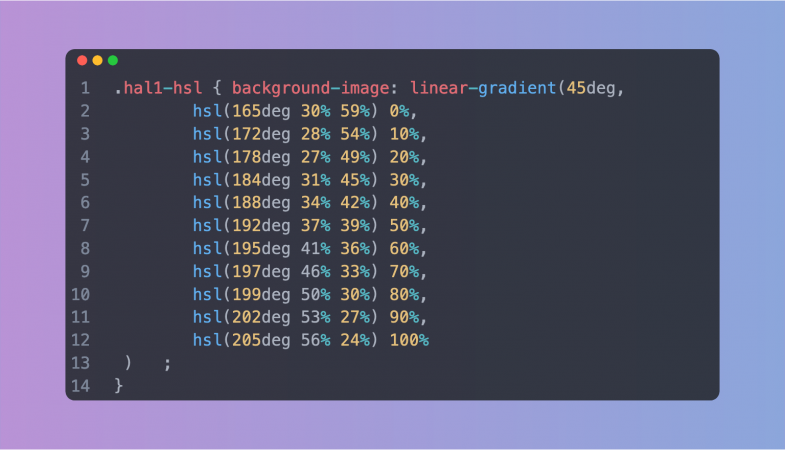
With both the basic RGB gradients and the optional noise additions in place, I began thinking about re-creating the set using HSL (hue, saturation, lightness) color values. Why? As mentioned in the aside above, different color modes along with additional color stops can help create a smoother, better looking gradient. In working with color and gradients, I’ve definitely seen some dramatic differences. Plus, it gives people the option to work with, and customize, the set that they like best. So how best to do this? Luckily, there’s some wonderful tools out there to help. I ended up using this tool with eight color stops in a straight linear curve. These new HSL gradients were added into the style sheet. Since I had spent so much time getting the RGB versions as smooth as possible, I didn’t see a tremendous difference with the new HSL values, but you can be the judge.

Putting it all together

With the gradients looking good, I started having fun with the page design to really capture the spirit of the movie. The gradient swatches were set up using CSS display:grid and setting the columns to repeat(auto-fill, minmax(200px, 1fr)). This fills the parent container with swatches as long as they are a minimum of 200 pixels wide. Short and sweet, automatic responsive behavior. The columns contract and stack as the screen gets smaller. I set a small border-radius on the swatches to help them mimic the shape of the monitors in the movie, added a bottom margin for spacing and the swatches were set. It was then just a matter of replicating each swatch <article> with the appropriate CSS class.

The colors for the rest of the page elements were also pulled from the movie stills. The page background, the type color, the button colors — all are from the movie — albeit adjusted a bit to make them more harmonious with the overall design. Nothing fancy with the color modes here, just the basic hex colors sampled from the stills.

The typography was another fun aspect. The type choice was never really a choice as the movie (and many other scifi films) uses Eurostile almost exclusively in the ship screens. I used the extended variant of the typeface and transformed everything to all caps using CSS. But once I had the type set up and the text in place, it still didn’t look right. Or to be more precise, it looked too right. It looked like a modern page. The text was sharp and crisp which didn’t reflect the time period or the technology used in the 1960s. The answer was to add a tiny bit of blur via the CSS filter:blur() property. This really brought the overall design to life. The whole thing really started to feel like a vintage CRT screen. It really is all about the subtle details to create the feel of a project.

Overall, I think it looks great and I’m happy with the final colors. Is it useful? Maybe not, but perhaps you’ve got a project where you need some nice gradients. Or perhaps, you’re just a scifi fan and this is a good reason to watch the film again. Either way, I’m glad I took the time to add to the movie’s legacy in some small way.

View the gallery and download the style sheet

The Symbology Project

April 11, 2020


This week I’m taking a little time to (finally) write up a summary of an old personal illustration project from my Instagram feed.

The Background

Early on in my design career, I used the first hour of the day to draw something — everyday. As I was learning both about illustration and the software, I usually chose to recreate something I liked. Back in those days, it was probably one of the great promo illustrations from Charles S. Anderson for French Paper. These had a mid-century modern feel with a cartoon edge and some humor coupled with great details.

Flash forward many many years and I found myself doing less hands on illustration due both to career advancement and a lack of time (which were linked). Reminiscing on those early days, I wanted to get back to drawing without a brief, client or project — just drawing for my own sake.  Luckily, I was able to take a sabbatical from work to relax and recharge which gave me all the time I needed. There was no real plan other than that — I was just going to start my day, everyday, with a coffee and an hour of drawing.

The Inspiration

As a science fiction fan who read too much and grew up with the first video games, it didn’t take me long to find inspiration. My wife and I had been playing a bunch of Destiny and I found myself, as I do in many situations, looking closely at the user interface details. Those little items that somehow bridge the gap between typography and iconography to communicate meaning. I’ve always been fascinated with this translation of symbol and meaning, so it’s no wonder I found myself working in design, branding and UI/UX. In video games, these small details help build the world while serving the dual purpose of being recognizable to the players with tangible, functional meaning. I also think that the nature of science fiction, the duality between science and fiction, is engaging for me. It’s unknown, new, futuristic, off world and yet paired with a level of precision and rigor which spurs my curiosity.

The Illustrations

Looking at all these details (and having worked with video game companies), I know how much work goes into everything, even things you think are simple or that most people gloss over — all of them are crafted. I wanted to understand what went into these drawings, the shapes and the lines. I set myself the task to pick out elements and to redraw them, but to reduce them to their most basic parts. It was sort of like trying to get to the core of their meaning by stripping away the game story and context. No fancy textures, renders or even gradients for that matter. Just the element in two or three flat colors, out of context and standing on it’s own. No explanation or description.

With the project outline in mind, the rest was fairly straightforward. It was just a matter of paying attention while playing, taking a quick screenshot and then using that as a reference for color and shape. Any Destiny player, will immediately recognize many of these symbols proving that even detached from their original art, story and context, their meaning still translates. And yet, there are also many that players wouldn’t have noticed — ones that they’ve probably seen a million times, but never focused on.

The first run was about a dozen symbols during my sabbatical and I found it immensely satisfying to study the symbol construction in terms of art while thinking on how they construed meaning. I don’t think I even published them to Instagram, but just stashed them away in a folder. Once back at work and with the daily grind pushing on my time, I put the project aside for a while as I got caught in other things.

But I found myself missing the simple, quick process of drawing each symbol, somehow capturing it’s meaning and essence through drawing it. I think it’s probably similar to learning how to write, when you first grab a pencil and start drawing letters. And the Destiny game itself did not stand still. It released new expansions which lured me back into playing. And that in turn, led me to revisit the project with new vigor. I drew every weekend and started posting them on my feed. I eventually put down my controller (for health reasons, not for any love lost for gaming) and the project sputtered to a halt. By that point though, I had drawn 121 symbols and was ready for a new challenge.

You can see them all in the video above or scroll through my Instagram feed to study them (and more) in detail.

Final Thoughts

Overall, I’m happy with the project and how the illustrations turned out. I cringe at a few of them looking back, but there are many that I just absolutely adore as mysterious symbols. As I’ve described, it really speaks to my work in design, but coupled with the fun of science fiction and video games. It was great to have that commitment to the practice of making and that’s one of the best lessons that I’ve taken away from the project. The commitment to a schedule of production separated from outside forces. Do the work, have fun and do it regularly. And do it for yourself. This project had no recognition, no awards and nothing went viral. It stands as it is.

Finally, a big thanks to all the game artists and developers for all their hard work. Rest assured, we know it’s not easy, we’re out here, we’re fans and we’re inspired by the work you do.