Symbology: Part Two

May 8, 2022

This is a follow up post to the original blog post. Go read it to learn the inspiration for the project.

View the new project page here.

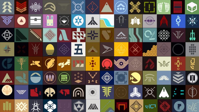
A grid of squares, each an illustration of a symbol from the videogame Destiny

Over the last few years, there’s been a lot of discussion in the web and design community about “owning your content.” Partly a backlash to the corporate platform takeover, partly a desire to actually create something unique. There’s a definite nostalgia for the early days of the internet when websites were a beautiful haphazard journey around the world into someone’s domain.

Platforms are great for ease of use, but little did we know about the harvesting and selling of our data. Not to mention the straight up fuckery around monetizing hatred and sowing discord. Don’t get me wrong, I’m as guilty as the rest of you in creating accounts on the big platforms. When they first came online, it was a arms race of FOMO as I tried to secure my preferred user name and join the communities where I thought I needed to be seen. I think this all happened in a gray area between where browsers, dial-up, web hosting, HTML, CSS and Javascript were all a little stagnant and confusing. Somewhere between the pages filled with purple visited links and the shiny perfect user interfaces provided by gated communities. Of course, Adobe Flash filled the void for those more design or technically minded, but it was still difficult, expensive and therefore beyond the average user. So the platforms flourished and we all flocked leaving our sites stagnant.

Now it seems we’re all remembering what we left behind. Or at least, dusting off our blogs and creating projects just because we can. Just because we want to. I’ve never gone so far as to ignore this blog despite my post volume fluctuating with the ups and downs of life (this is my 300th post!), but I certainly left behind the creation of pages and sites that were simply fun exercises. I think I got stuck in the delusion that every project, every idea needed a unique domain name when in reality, it just needed a folder on my hard drive, a directory on my web server. Not every idea needs to be a financial success nor a financial burden. Frankly, it’s been liberating to remember that time when I was creating and putting all manner of weird and wonderful web pages online. I’ll probably have to dig through old hard drives to find some of those ideas, if only to reminisce.

I’m not sure I was actively considering all the above when I started with my latest projects. I think it may have been that they didn’t fit into a traditional “blog post” nor did they fit into a “work portfolio”. Projects like creating a set of CSS colors based on a science fiction movie are hard to place. Same goes for creating a virtual bookcase. They’re really just for me, just for fun and no less valid than any other project! As an artist, it’s sometimes hard to remember the latter.

So how did we get back to this old symbology project?

I came across this beautiful typography project by another designer (hosted on one of those corporate platforms) which was also inspired by the Destiny video game. This got me a bit nostalgic and I started looking back at all the symbols I had previously drawn. What I realized was that, despite the blog post about the project and even including a video of the symbols in the post, the entire thing was hosted on my Instagram account. And by virtue of the nature of the platform, the individual pieces were now buried in the feed. You’re not really able to see them all as a whole. (Not to mention the issues of copyright with Instagram and surveillance capitalism in general.)

Feeling a bit re-inspired, I’ve gone back, grabbed all (or most) of the original drawings, prepped them and built out a single page with the project. In terms of development, it’s all fairly basic HTML and CSS using the <figure> element to hold each image saved as an SVG file. I added a bit of flair by including the Destiny logo and a game background image for the hero. There’s CSS grid for the responsive layout and a little return to top button via a bit of Javascript (which I think I need to update to perform better). The hardest part of the whole thing was probably writing ALT text for each image — both from a volume perspective (118 images) as well as from a content perspective (it’s hard to describe a symbol from a science fiction story).

The project is now available to view as a complete set with the bonus of not having the UI distractions nor the advertising of Instagram. All in all, I think it’s a much better experience and I’m happy to have it all in one, self hosted place.

View the new project page here.

War Sign

March 20, 2021

For a while now, as I’ve been working on symbols and icons, I’ve been thinking of opposites. The on/off icon switches we see throughout our digital lives. Am I on mute? Can you see my screen? These little yes/no binary icon changes to alert us in minuscule ways to our state of being. Each state is paired with it’s opposing force and we learn to recognize each as we build a library of shared acceptance. A common understanding if you will.

The concept of dualism as expressed by the yin and yang in ancient Chinese philosophy would say that each needs a counterpart in order to be whole. But there are symbols in our lives that do not seem to have an opposite and perhaps without both sides, we cannot have understanding. We’re only seeing one half of the picture.

This absence has always bugged me in particular around one symbol — the peace symbol. Now my annoyance probably has more to do with my nihilism and personal experiences than anything else. But coupled with a tendency to be a videogame completionist and being a designer, every time I see a peace sign, I wonder, where’s the war sign? Where’s the sign for those of us who see the dark?

Learning more about the origins of the peace symbol — probably via 99 Percent Invisible — finally gave me the push to create an opposing icon, a war sign to provide balance. Using the same flag semaphore base as the original, I’ve created a war sign.

war sign

The original peace sign uses the semaphore “N” and “D” for “nuclear disarmament” while this war sign uses the “N” and “W” for “nuclear war.” A grim thought, I know.

The peace sign was designed to express an element of despair while this war sign definitely has a more aggressive stance, even with the same “N” shape in place. Instead of drawing the eye down, it moves to the right and conjures an explosive element. It almost reminds me of the safety and hazard symbols used in science and transportation.

With the world at war for the last 20 years (or even longer depending on your framework) and the U.S. government continuing to keep the AUMF on the books so that it can declare war (without declaring war) any time it wants, we live in a time of war. Sadly, we need a symbol, a war sign. Perhaps with a symbol for both sides, we can gain an understanding of the whole and how each works in concert with the other.

Note: I’m certainly not promoting war. Don’t be silly. Quite the opposite in fact. I just think that denying war or keeping it invisible doesn’t work. Finally, despite a bit of intellectual meandering above, I’m realistic. This symbol will probably get used more by metal bands than anyone else. And I’m okay with that too.

You can download the war sign here.

Empire

March 13, 2021

With The Expanse in between seasons, we’ve gone back to the Star Wars franchise to get our science fiction fix. And while we work our way through The Mandalorian series, we pulled up Rogue One the other afternoon just to take a break from all the cuteness of baby Yoda. Nothing like a tragic tale of death and sacrifice to clear out the sinuses. Somewhere in the middle of the movie, I came across this symbol and headed down the rabbit hole of Star Wars art and iconography.

Now, ever since the early days, the franchise has had great art direction and a good set of icons — from the circular Empire symbol to the Rebel Alliance logo. Simple, recognizable and emotive. As a side effect, they’re easy to reproduce which has led to a ton of mommy blog crafting posts with customized merchandise.

Given all this, I was surprised when I saw this logo in the movie — one I can’t remember seeing before. In the mission on Eadu scene, the Empire science officers who are developing the Death Star are all wearing white jumpsuits with this logo patch on their upper arms.

Star Wars Rogue One Empire Science Officer Logo

For me, it’s the perfect symbol for the Death Star. It communicates the basic shape along with the firing mechanism. So I had to draw it up quick and you can download the icon here.


Unsmilely

January 24, 2021

Unsmilely Icon Set

There’s a natural ebb and flow to projects. An initial burst of inspiration creating momentum that slowly fades as the hard work and all too often, the insecurity sets in. This is one of those projects.

Originally drawn in 2017, it’s hard to recall the exact source of inspiration, but in hindsight, they seem a reaction to both the political landscape at the time as well as the sugar saturation of skeuomorphism in the standard emoji world. Like in my symbology project, these are a study in the reduction of the extraneous to reveal the core.

I think the other goal, given their simplicity, was always to animate them. The only question, and this is where the project ebb started, was how to best create the animation. And so, what started out as an excuse to learn new software applications — a tedious task which sucked any joy out of the project via frustration — led to stagnation. It was only recently when my web work sparked the idea of animating these via CSS. Now, there was still a ton of learning to do with this CSS only approach, but at least I had a stronger foundation having done it before with small things and these icons are in essence, a gr0up of small things.

Here’s a quick video demo of the animation.


And for those more inclined, here’s a Codepen with all the HTML/CSS.

See the Pen
Unsmilely Icon #1
by strongest (@strongest)
on CodePen.

The full collection on Codepen is available here: https://codepen.io/collection/XjoBzV

Or download the complete set to get the images.

The Symbology Project

April 11, 2020


This week I’m taking a little time to (finally) write up a summary of an old personal illustration project from my Instagram feed.

The Background

Early on in my design career, I used the first hour of the day to draw something — everyday. As I was learning both about illustration and the software, I usually chose to recreate something I liked. Back in those days, it was probably one of the great promo illustrations from Charles S. Anderson for French Paper. These had a mid-century modern feel with a cartoon edge and some humor coupled with great details.

Flash forward many many years and I found myself doing less hands on illustration due both to career advancement and a lack of time (which were linked). Reminiscing on those early days, I wanted to get back to drawing without a brief, client or project — just drawing for my own sake.  Luckily, I was able to take a sabbatical from work to relax and recharge which gave me all the time I needed. There was no real plan other than that — I was just going to start my day, everyday, with a coffee and an hour of drawing.

The Inspiration

As a science fiction fan who read too much and grew up with the first video games, it didn’t take me long to find inspiration. My wife and I had been playing a bunch of Destiny and I found myself, as I do in many situations, looking closely at the user interface details. Those little items that somehow bridge the gap between typography and iconography to communicate meaning. I’ve always been fascinated with this translation of symbol and meaning, so it’s no wonder I found myself working in design, branding and UI/UX. In video games, these small details help build the world while serving the dual purpose of being recognizable to the players with tangible, functional meaning. I also think that the nature of science fiction, the duality between science and fiction, is engaging for me. It’s unknown, new, futuristic, off world and yet paired with a level of precision and rigor which spurs my curiosity.

The Illustrations

Looking at all these details (and having worked with video game companies), I know how much work goes into everything, even things you think are simple or that most people gloss over — all of them are crafted. I wanted to understand what went into these drawings, the shapes and the lines. I set myself the task to pick out elements and to redraw them, but to reduce them to their most basic parts. It was sort of like trying to get to the core of their meaning by stripping away the game story and context. No fancy textures, renders or even gradients for that matter. Just the element in two or three flat colors, out of context and standing on it’s own. No explanation or description.

With the project outline in mind, the rest was fairly straightforward. It was just a matter of paying attention while playing, taking a quick screenshot and then using that as a reference for color and shape. Any Destiny player, will immediately recognize many of these symbols proving that even detached from their original art, story and context, their meaning still translates. And yet, there are also many that players wouldn’t have noticed — ones that they’ve probably seen a million times, but never focused on.

The first run was about a dozen symbols during my sabbatical and I found it immensely satisfying to study the symbol construction in terms of art while thinking on how they construed meaning. I don’t think I even published them to Instagram, but just stashed them away in a folder. Once back at work and with the daily grind pushing on my time, I put the project aside for a while as I got caught in other things.

But I found myself missing the simple, quick process of drawing each symbol, somehow capturing it’s meaning and essence through drawing it. I think it’s probably similar to learning how to write, when you first grab a pencil and start drawing letters. And the Destiny game itself did not stand still. It released new expansions which lured me back into playing. And that in turn, led me to revisit the project with new vigor. I drew every weekend and started posting them on my feed. I eventually put down my controller (for health reasons, not for any love lost for gaming) and the project sputtered to a halt. By that point though, I had drawn 121 symbols and was ready for a new challenge.

You can see them all in the video above or scroll through my Instagram feed to study them (and more) in detail.

Final Thoughts

Overall, I’m happy with the project and how the illustrations turned out. I cringe at a few of them looking back, but there are many that I just absolutely adore as mysterious symbols. As I’ve described, it really speaks to my work in design, but coupled with the fun of science fiction and video games. It was great to have that commitment to the practice of making and that’s one of the best lessons that I’ve taken away from the project. The commitment to a schedule of production separated from outside forces. Do the work, have fun and do it regularly. And do it for yourself. This project had no recognition, no awards and nothing went viral. It stands as it is.

Finally, a big thanks to all the game artists and developers for all their hard work. Rest assured, we know it’s not easy, we’re out here, we’re fans and we’re inspired by the work you do.