History Lesson
July 5, 2025
Helping a Vietnam Veteran share his photos and stories from the war

On March 8th, 2024 I was able to launch a side project for my father-in-law Bruce Tester that has been banging around between us for years. We get excited, get distracted, get busy, get back to it and the cycle would repeat. This post is a summary of the design and development of the site as well as the history of all our fits and starts.
The Background
Bruce is an accomplished photographer and with my design background, we’ve spent countless hours geeking out over Photoshop, the latest digital cameras, scanners, printers and all manner of photography related equipment. Many times, I’ve happily ended up being his de facto photographer’s assistant lugging around gear and setting up for a golden hour landscape shot or a time lapse night shoot. Bruce is humble about his photography and despite filling his house with gorgeous prints, he doesn’t really promote his photos. My wife and I have always loved his work and would (gently) push him to display them somewhere, but to no avail. Finally, for one holiday gift, I bought him his own domain, set up hosting on my account and volunteered to set up a site for his photos.
First Attempts
For quick setup and ease of use, I installed WordPress for him and threw a couple of his photos in place using a free photography theme. I tweaked the type a bit, created a quick logo of sorts and posted some photos to show him what was possible. And that’s was where it sat. For years. We both got busy with life and it was always more fun to take photos versus building a photography website.
Getting Serious
Once Bruce retired, he finally had the time to begin digging through his photo archives, retouching and organizing thousands of photos. This is when we came back to the idea of creating a web archive for his photos. The collection that was in many ways, most important to him, were his photos from his time in Vietnam. Since we already had WordPress installed, he began feeding my sample photos and I started setting up test pages.
Of course, like many projects, as we reviewed and discussed the test pages we found the site wasn’t quite accomplishing what he wanted. I had even given him some basic WordPress training, so he could upload photos and create pages, but it just wasn’t working out. He wanted to write more about each photo, write more about his time in the Marines and organize the photos into subsections to better tell his story. In short, the theme wasn’t working out. I searched for other themes and tried several, but the more we talked, the more it dawned on me — we needed to build it from scratch. It would certainly be a ton more work, but we create something unique, personalized and beautiful.
The Design
The decision to finally build the site by hand was in many ways, a huge relief. While I’ve used WordPress for years and years (and still do for this blog), I’ve grown beyond the framework and it’s limitations are now irritations. Starting from a blank page was freeing and more inline with the majority of my recent efforts. Hand crafted instead of framework dependency.
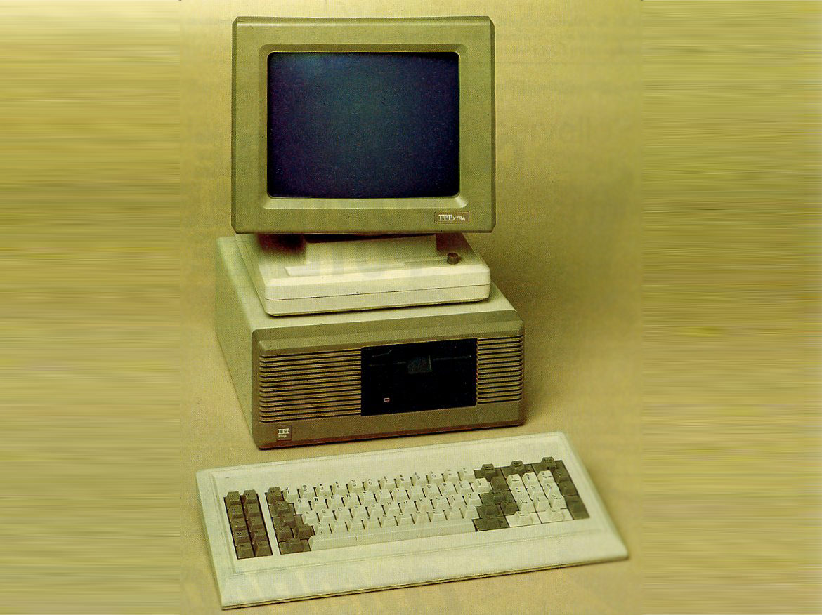
Overall, the design inspiration was really about the time period — the 1960s. And not the free love, hippie, psychedelic day glow lettering 1960s. The other America. The more conservative 1950s generation with buzz cuts and starched shirts. Looking through the command diaries and cruise book Bruce provided really got me thinking about what “official” document design looked like back then. I started researching other government publications.
The primary goal of the site was of course, to focus on the photos. The site hierarchy was a basic thumbnail gallery leading to individual photo pages. Nothing crazy there. Navigation is a simple masthead with a drop down menu along with a breadcrumb link navigation at the bottom of each interior page. The breadcrumb links expose the structure and allow for jump navigation. Within each photo page there is also a previous/next link navigation so you can alternatively progress through the site in a linear fashion.
Framing the photos and lifting them off the page a bit was another design choice to help separate and define the content, directing attention and focus. The site colors were all muted tones: blacks, whites and warm grays — all in service of the UI and not to interfere with the photos.
The typography was chosen to split between the site UI (menu, navigation, etc.) and the content. For the UI, the Inter font family was perfect. It’s got lots of options, it’s very legible and modern, but also not showy. Like the UI colors, it’s not going to distract from the content. For the text content itself, I loved the look and feel of the typewriter style fonts used in the command diaries. Going with a monospace font like Courier New helped anchor the content in it’s original time.
The one page where I did have a bit of fun was on the About page. I was able to grab a few of the military stamps (“Confidential”, “Unclassified”) from the command diaries along with a bit of texture to add to the background. I think these little touches help to keep the page from being too clean and sterile.
The Development
The site is super old school in terms of development — semantic HTML with CSS for style. The only Javascript used is for the main drop down menu and that’s just for the button event to show and hide the menu. Choosing this direction rather than the latest framework flavor was important as the site is a historical document. I always had to keep in mind that i was building for the future. Keeping it simple and using the proven standards that the web was founded on would help ensure that the site would work well into the future. The entire project is essentially a library archive to help tell part of American history. It was a responsibility I did not take lightly.
Accessibility and the Audience
Accessibility is always a requirement, but as we worked through initial pages, it became even more important as we really considered the potential audience. Given the historical content (and using Bruce himself as a tester), we realized we needed to add design elements to cater to an older audience. Adding numbers to each photo in a category, not only helped us in production, but also gives a reference anchor for visitors. The same is true with the text overlay that appears on hover for each thumbnail. The “click to view” instructions help guide visitors to the full size photos. This was a great exercise in recognizing and adjusting our bias — just because we’re click happy youngsters doesn’t mean folks over the age of 70 would understand the implied navigation. Similarly, adding some “how-to” text to the home and about pages helps to make it obvious.
Education and Production
One of the other parts of the development process was education. Bruce has no idea about the mechanics of good website structure, accessibility or SEO and nor should he. He’s the photographer. This lead to some back and forth as I taught him about <h1> tags, why they were important and why we needed one written for every page. All 400 plus pages. So the production process was Bruce writing and reviewing test pages while I focused on batch image formatting, resizing, optimization and even naming for better SEO. The same was true for the HTML side. Sessions of duplicating files, updating the content and links while capturing and handling any unique content that a specific page might have.
One production and accessibility aspect that I also tackled was writing the alt text for the photos. This let Bruce focus on the photos, titles and the overall story. Now, writing descriptions for 400 photos was no small task and at times it did seem overwhelming. After about twenty, you start to burn out and your eyes blur over. Admittedly, some of the descriptions might sound a bit lazy and in a twist, the WebAIM WAVE tool flags some of them as being too long. I do take a bit of pride in providing good alt text, so it’s a warning I’m willing to set aside especially as this is a photography site.
Other production notes include creating open graph images and the site’s favicon. The challenge for the open graph image was to come up with the text to help “package” the entire project. Given Bruce’s other landscape photography work, I could envision adding new sections to the site and moving this entire project to a sub directory. Thinking about that possible future helped me to consider this project a “collection” which then made the open graph designs fairly easily. Designing the favicon, on the other hand, was much more difficult. The site is personal, so it doesn’t have a logo per se. With no logo and a fairly subdued color palette, there wasn’t any material to rely on. I wanted something dramatic, probably because I suffer from too many browser tabs being open at a time. Initial inspiration came from the Marine Corp itself. Namely, the colors. The red and yellow combination is certainly dramatic and jumps out in a browser tab. The second bit of inspiration was the idea of old camera lens iconography. I worked through a few different, more classical lens shutter icons before settling on an abstract approach.
Performance
Things could always been improved and you can chase down minor improvements for a long long time. Overall though, Google PageSpeed is happy with scores of nearly 100 across the board for desktop (the intended profile). The results for mobile are also impressive if a bit lower for the performance metric.

Performance reports from GT Metrix and YellowLabs also confirm the site is doing pretty well.
Likewise, the site HTML and CSS both validate without issues. Interesting to note that the WebAIM WAVE tool shows the thumbnail hover text as failing color contrast even when the color combination is well above the WCAG 2.2 Level AA ratio. Turns out it’s due to the opacity being zero. Once the thumbnail is hovered, the text opacity changes to 100%, so the error is a bit of a false positive.
Conclusion
Overall, I’m really happy with the way the site turned out. It feels very professional and I think I’ve lived up to the responsibility to tell the story. As the grandson of a history teacher and as a child born during the Vietnam War, I feel passionately about accurately telling stories like this for the future. Heck, I think I bought Bruce the web domain for Christmas back in 2008! It only took us 16 years to build something really great. Hopefully, it’s also worthy of Bruce and the all men and woman who served in the war.


