Rorsch
March 4, 2023
Work long enough with computers and you’re bound to lose some data. This project is a bit about reclaiming a lost set of illustrations as well as a chance to design and develop another custom web project.
The history
The original illustrations were drawn back in San Francisco about 20 years ago. There somewhat generative and they’re somewhat true to the folded inkblot process of the original Rorschach test with near perfect symmetry. As I recall, I was just playing around with some of the features in Adobe Illustrator allowing the application to spit out a shape based on my transformation inputs and then copying, flipping and combining the two halves. There was no commercial project or business goal. It was just for creative experimentation and learning. Once I created one, I really liked the final effect and went about creating some more to see what the partially random process would produce. There was something intriguing in the shapes and spiked angles that I really enjoyed. So I dropped them onto a large art board and printed them out on a sheet of 12″ x 18″ white paper.
The Illustrator file was dropped into some folder on a hard drive, never to be seen again. The page sat in a giant pile of test prints for twenty years.
The discovery
Flash forward through the decades and although I had kept the pile of test prints, they had been relegated to a box in storage. After buying a house, I finally had a chance to set up an office and studio which led to pulling out and digging through all sorts of ephemera from my design career — most notably for this story — a box of test prints.
Seeing the print of these illustrations once again brought back the original joy and inspiration. I quickly set off on a digital forensic search of various hard drives, ZIP archives, CDs and DVDs to look for the source file. Alas, as you may have gathered from the introduction, the file was not to be found. It may still exist, but I can’t find it and my patience for searching has been exhausted. There comes a point where you have to call off the search for the sake of moving ahead. Perhaps someday, an archivist (or intern) will meticulously sort and catalog all of the nonsense I’ve created.
The (re)discovery
With only a print and no digital file — and with the desire to do something with the illustrations — I went about the task of reviving them. I scanned them all at high resolution, converted them from raster to vector and then individually edited the paths to try to get as close the originals as I could. Now of course, there’s probably going to be some differences and some loss of detail in the translation process. It’s unfortunate, but not unexpected and overall, I’m happy with the results. Better to have a file I can work with.
But what to do with the illustrations now that they were back in digital form?
The project
Conceptually, they had always reminded me of inkblots from a Rorschach test, so that was really my frame of reference for presenting them on the web. I considered animating them all in a series, morphing them from one into another, but that approach, while attractive as a technical challenge, didn’t feel emotionally true to the inspiration.
A bit of luck and a bit of research really got the art direction and design for the page started. The luck came in the form of some type samples from the Letterform archive that came across my feed. The research led to the realization that the Rorschach test and the Bauhaus were occurring at the same time — the 1920s. No self respecting designer can go through their career without a bit of study (and possibly reverence) for the Bauhaus, so it was a natural place to start in terms of the typography for this project. I love vintage paper and tons of texture and the faded red and black ink in the old print samples is just fantastic. The historical relationship between the two just made sense in terms of the design direction.
The development
The first step was to capture those faded colors into a web palette. A bit of sampling along with some trial and error and I had a good set of colors to work with. I set them as custom properties (variables) in the CSS to make them easier to work with during the initial design phase.
--wheat: hsla(39, 67%, 82%, 1);
--gold-crayola: hsla(36, 58%, 74%, 1);
--light-french-beige: hsla(35, 38%, 62%, 1);
--copper-red: hsla(18, 48%, 57%, 1);
--fire-opal: hsla(6, 74%, 63%, 1);
--cafe-noir: hsla(28, 38%, 21%, 1);
--blk: rgba(51,54,47,1);
(I have no idea about the color names themselves. I think they were generated by the tool I was using and don’t really correlate to actual CSS color names. I left them in place out of laziness, but normally, I would have come up with my own, shorter names. The last color, “blk” is an example of how I would normally name color variables. As to why I used HSLA for some color values and RGBA for the last, again laziness. I should have cleaned it up, but…better to ship it out. And yes, I probably don’t need the alpha “A” in there for modern browsers, but I haven’t mentally made the switch as I write.)
For the typography, I wanted to go true vintage and see what actual Bauhaus type I could find. I stumbled upon Breite Grotesk from the Schelter & Giesecke type foundry which was an influence on the Bauhaus movement and thankfully, there was a remake from Nick Curtis that looked really great on the page.
For the page design, this was really a giant exploration of blend modes, masking, gradients and backgrounds albeit mostly without success.
Since the original ink blots were each on their own card, I wanted to try to replicate that experience. Adding a vertical scroll snap to the page allows for each to stand on it’s own.
scroll-snap-type: y mandatory;For the page background itself, I wanted to try to mimic that old newspaper print seen in the Bauhaus examples. I started by setting a base background color and a large box shadow to darken the edges. I then included two background images — a vintage paper and a gritty texture — and set the blend mode for them to multiply which creates the effect. It’s not quite what I wanted (is it ever?), but it’s close enough.
background-color: var(--wheat);
background-image: url("../img/whitegrit.webp"),url("../img/paper1.webp");
background-blend-mode: multiply;
box-shadow: inset 0 0 48px 36px hsla(35,38%,62%,.7);
It’s worth noting that the backgrounds stay fixed to the page and then the content then scrolls. It kind of ruins the effect, but it does help maintain a smooth experience. It’s a trade off. You get the same background for each card, but each card stands on it’s own — and without a break when you scroll. I didn’t want a new background to scroll into place with each card. Beyond the performance hit of loading 15 separate backgrounds, the hard line/difference between each background just bothered me.
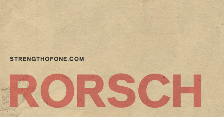
For the large <h1> title, I wanted to try to add more texture within the characters. It’s an effect I’ve seen elsewhere and wanted to try out. Again, it was to fit with the art direction and the vintage feel of the old Bauhaus prints. Turns out it takes a bunch of techniques to create the effect.
At the base level, we’re setting the color of the text to transparent, using texture as a background, clipping the background to only the characters, applying a blend mode and then reducing the opacity just a tiny bit to try to match that vintage red print color. I know, I know. It’s sounds like a lot. But we’re not done!
At this point we’ve got a textured background that’s slightly see through, inside characters that have no color. The text itself is normal HTML. You can select it, but it’s not very visible. It’s does have texture though.
color: transparent;
overflow-wrap: break-word;
background: url(../img/texture1.webp);
background-clip: text;
mix-blend-mode: multiply;
opacity: .8;
So…how do we get the color into the text? We use a pseudo class! We set the ::after property to contain the text — via a data attribute — and the color. Then add a bit of a blend mode and position it correctly and we’re all set.
content: attr(data-text);
position: absolute;
left: 0;
top: 0;
color: var(--fire-opal);
mix-blend-mode: multiply;
Yeah, I know. It all sounds a bit much. Or a bit confusing. Or both. Please don’t get discouraged if you’re just starting out. It’s all about experimentation and tweaking little things to see how it works.
A few other tidbits in the design to explain, mostly about the exact thing I mention above — trial and error. For each of the inkblots I initially wanted to add a different background texture to make them appear more inky or watery. Sounded easy at first glance, but there were definitely tech challenges. The main idea was to use each inkblot SVG file as a mask for the watercolor texture file. This worked initially, but the SVG’s themselves were way more complex and often had multiple separate paths — meaning the code size exploded as I was essentially dropping the SVG code into the CSS as well as including it as a link on the page. I tried just using one of the SVG paths as the mask, but this looked odd as only one part of the inkblot had the texture and the others did not. So…I just paired back the opacity of each and added a tiny bit of blur via a CSS filter to give them the more vintage look.
I did take one little typographic liberty at the start. I wanted to use some sort of arrow to indicate visitors should scroll. But since the typeface didn’t have an arrow glyph, I repurposed a dagger glyph. It’s certainly not what the glyph was intended for, but it’s kind of neat and animating it wasn’t too hard. Again, I used a ::pseudo class to drop it into place and animated with CSS keyframes.
span {
  mix-blend-mode: overlay;
  transition: all .3s ease;
  animation-name: fadedown;
  animation-delay: 0s;
  animation-duration: 2s;
  animation-iteration-count: infinite;
}
@keyframes fadedown{
  0% {
    opacity: 0;
    transform: translateY(-1rem);
  }
  90% {
    opacity: .7;
    transform: translateY(0);
  }
  100% {
    opacity: 0;
  }
}
span::after {
  content: '\2020';
  color: var(--fire-opal);
}
There’s more to the full CSS, but I’ve omitted the stuff that just handles things like margin or font choice.
Overall, it was good to get these illustrations to some sort of final resting place and to connect them, in some small way, with their inspiration. I’m a big fan of adding texture, so I’m sure I’ll revisit many of these techniques on other projects and continue to follow along as methods change and improve.
Also worth noting that these are just illustrations and should not be used for psychiatry. 🙂