Heart
February 14, 2024
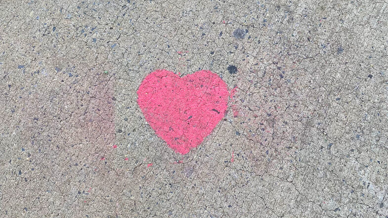
Just a solitary heart graffiti left for us to find.
West Side, Manhattan.
February 14, 2024
Just a solitary heart graffiti left for us to find.
West Side, Manhattan.
February 10, 2024
When first moving into our house, my wife and I would find little items while digging around our yard. Antique nails from when the house was first built, marbles and toys from the kids who lived here before us, a hinge off of one of the shutters — just little things like that which I started calling “local archeology”. If we found something interesting, I would photograph it and post it on Instagram. Nothing too special and without any real plan. It was just an inside joke between us that I started using as a hash tag.
We’re lucky enough to live across the street from a state nature preserve and as we settled in to our new neighborhood, I began noticing more little things. Most notable was the trash and litter that would build up on the fence line with the preserve. Now, as I would stand around in the yard enjoying a cigar, this really started to bother me. I wanted to enjoy the expanse of forest in front of me without the eyesore of litter ruining the experience. Being of the “see a problem, solve a problem” persuasion, I started wandering across the street and picking up any bottles, cans or plastic bags that I would find along the fence line in front of our house.
Unfortunately, the more I looked beyond the fence deeper into preserve, the more trash I saw. A bit disappointing, but still rather ignorantly undaunted, I started heading into the park with a couple of five gallon buckets to pick up the trash along the roads near the house. The deeper I wandered through the trees through, the bigger the scale and magnitude of the problem became and the true beginning of this project began. What started as just picking up a stray beer can or coffee cup became pulling out large scale commercial and industrial waste from illegal dumping.
The more I looked, the further I explored, the more I found. Each time I returned from a collection hike, I would regale my wife with whatever weird piece of trash I found and if it was interesting, I would snap a photo and post it. The local archeology inside joke moved from our yard to encompass the preserve. As I discovered the serious commercial waste, my wife recommended I start documenting everything — even the mundane. The photo gallery is a summary of many (but not all) of the trash we’ve been pulling out the forest.
Starting in March 2023, I started recording how many trash bags I packed full of litter on each hike. Here’s the break down.
| Month | Trash Bags |
| March | 33 |
| April | 6 |
| May | 3 |
| June | 4 |
| July | 0 |
| August | 5 |
| September | 6 |
| October | 6 |
| November | 0 |
| December | 5 |
| Total | 68 |
Each bag has a 33 gallon capacity, so with one gallon weighing 8.33 pounds, it’s a maximum total of 275 pounds per bag for a total of 18,700 pounds or 9.35 tons of trash. In reality, every bag wasn’t always full and there’s no way I (nor the town sanitation staff) could even lift a bag that heavy. Let’s be conservative and say each bag averaged out to around 50 pounds for a total of 1.7 tons. Tons. Nearly, 3,000 pounds of trash collected into bags and removed.
And that’s just trash. We still need to factor in recycling. Every time it’s feasibly possible, I’m also sorting items into our local recycling bin for pickup. In a busy month of hiking, our 35 gallon bin is completely full and 90% of that would be pulled from the preserve. Certain weeks, I’m also including multiple smaller bags full of metal, glass and plastic. While I don’t have any hard data on the exact volume, I’d estimate a full bin about 30 times in 2023 for around 8,700 pounds or 4.35 tons of recycling removed from the park. 4.35 tons of trash that was just rotting in the woods.
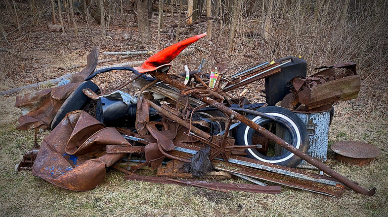
Beyond the little stuff you can pick up and put in a bag, there’s also the big stuff. All the larger items that need to be dragged out, picked up by the city or taken to the county dump. Here’s a (partial) list of some of those big ticket items.
It’s not until you start to see the totality of the situation that you begin to understand the level of damage. As I said, the numbers aren’t precise, but the pictures speak for themselves and I’m continually astounded (and dismayed) by what I find. I could go on and on about all the little weird things I’ve found.
Despite posting many photos of the smaller interesting finds on Instagram, I realized that many more were filling up my phone and hard drive. Hence the idea for a gallery to really show the effort in full. With only a couple of exceptions from 2022, the photos are all from 2023 and for the most part in chronological order.
The art direction doesn’t stray far from the general template I’ve been using recently for other single page projects. A header linking a back to the blog post, the main body of content and a footer with links off to other projects. From there, it’s a matter of styling and customization to fit the project theme.
The general inspiration comes from some of the archeology publications and sites. Sadly, they weren’t very inspiring as they’re designs were often outdated. About the most I could take from their pages was the serif headline, sans serif body copy pairing which, of course, isn’t very unique.
The color palette is Flexoki which is my new favorite as it speaks to my experience in print graphic design. The muted colors are warm and balanced. Admittedly, the design doesn’t take advantage of the full palette only using a few of the colors. It does use both light and dark themes depending on your settings. I’m fairly sure I’ll use the palette in future projects to really explore the full color set to see how they work across different design themes.
The fonts are Playfair Display for the headline (served locally) and Gibson for the body (served via Adobe). I really do love a heavyweight serif face and Playfair really looks great to convey a level of academic prestige (even if it’s a false notion). Gibson is used more sparingly as the gallery doesn’t really have much text. Again, the heavyweight version of the face are just fantastic and I really like how it looks for the subheads.
Like with the design, the basic template is the same as other recent projects using a CSS grid for the responsive layout. The only difference this time was to experiment with some column/row spans to mimic a masonry effect and showcase larger versions of some of the more interesting finds. It’s not a true masonry grid, but at certain viewport sizes, all the items nest and align nicely. At other sizes, gaps do appear, but that’s expected. There are Javascript libraries to achieve that true masonry effect, but here, where all the photos are the same aspect ratio, the JS overhead and complexity didn’t seem worth it.
Each photo has the opacity dimmed a little which normalizes on hover. This lets the photos blend a bit more with the color palette. On mouseover, they transition to appearing brighter and more rich which gives them impact. The photos can also be clicked on to open larger in a modal window. I’m using the a11y dialog script for the modal behavior. I experimented with adding a keyboard activated previous/next behavior to the modal, but kept getting the array numbering messed up in my Javascript, so I left it out. An update for another day or another project.
It’s a fair question to ask: Is this work having a positive or negative impact on the preserve? I’d argue that it’s having a positive impact. I work from the motto of yes, there may be some short term disruption, but it results in long term benefits. Similar to the idea of “leave no trace,” I work to repair any soil disturbance and contrary to the “archeology” title, there is no digging of any kind. Likewise, I rotate the areas I work in over days and weeks to allow the wildlife to reclaim the space. I’m also time limiting my work, so that I’m not in the area for more than an hour or two at most.
There is, of course, also an impact on me. I love walking in the woods and coming upon a new debris field or trash pile can turn my emotions upside down. Sometimes it makes me angry and frustrated. Other times, just sad and disappointed. Sometimes, its just too much and I can’t handle tackling an area as it just feels overwhelming. I’m starting to realize I need to work on a better balance to approach the work only when I’m in the right state of mind. On the positive side, there’s is a sense of pride when I’m able to remove a giant piece of junk from the preserve. I’m also stubborn, so I keep going back for more. It’s almost like to trying to finish a video game quest as it taps into your competitive nature. Maybe one day, I’ll come back from a walk with an empty bucket.
One of things I’ve come to notice is that the forest wants to get rid of the trash. It wants to be healed. Bottles and cans seem to be pushed up from the soil. Storms, rain, snow and animals uncover items bringing them to the surface. I can pick an area clean only to come back a month later to find more. I have to remind myself all the time that I’m not going to find it all today.
Will I continue? Yeah, most likely. There are three areas of commercial dumping (one in a federally protected wetlands) that I haven’t tackled yet. I know those areas will weigh on my mind if I don’t try to clean them up. I’m not going to stop walking in the woods and the benefits of doing that (exercise, fresh air, quiet) make the potential emotional turmoil worth it. I do get to see amazing things on almost every walk and I’m now starting to learn (and report) more on the ecology for my wife and her non-profit.
Finally, a thank you and shout out to the local sanitation department who has unwittingly been helping with this effort. I can only imagine what they’re thinking when the roll up to our house and see what I’ve put out for collection. Same goes for the county hazardous materials recovery facility. They’re always friendly, helpful and accommodating when I bring in a truck load of crazy stuff.
Please don’t litter.
January 13, 2024
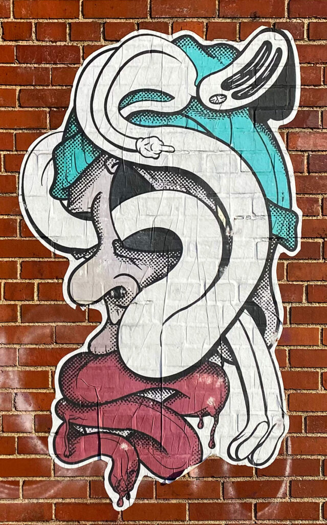
A really nice illustration. It may take a few extra seconds to figure out what’s going on though. The color is simple and bold. The killer part for me is the halftone shading. It’s amazing and gives all the depth the piece needs.
West Side, Manhattan.
December 9, 2023

A bit of gratitude for this holiday season. Here’s a giant mural on the side of one of the piers on the Hudson river. Don’t let the photo fool you — each letter is about 30 feet tall. As with any mural, and large lettering in particular, it’s always a feat to get the lines straight. Given the double drop shadow and overlapping text, this example is very well executed indeed. I don’t know the origin story and the pier itself is a bit worn down, but it’s a sentiment worth sharing.
West Side, Manhattan.
November 5, 2023
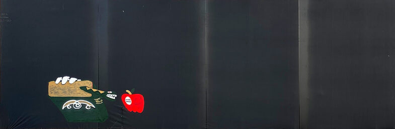
Outdoor advertising has always had an issue with staying current. In this case, the billboard is covered in large panels of black fabric. An interesting choice as it seems to impart a “world in grieving” kind of moment as if we’ve lost one of America’s great ads. Of course, I’m glad to see some enterprising artist has taken advantage of all that great empty space. As to what the image is or represents, as it often the case, I have no idea. Quite possibly, it’s a representation of knowledge as the enemy of religion, but using religious symbolism. Maybe? Instead of the tree of knowledge, we’re given a book with an odd symbol on the front. The text on the spine isn’t quite legible. The book is sprouting the snake who is menacing the apple which in turn has some illegible text in the white circle. On a technical level, it doesn’t look to be sprayed on, but hand painted. Given the location, climbing up scaffolding or out a window with paint buckets is very impressive. Sometimes with art, you may not know what’s going on, but you can still appreciate (and interpret for yourself), the impression, the detail and the meaning it impacts on you personally.
West Side, Manhattan.
October 14, 2023
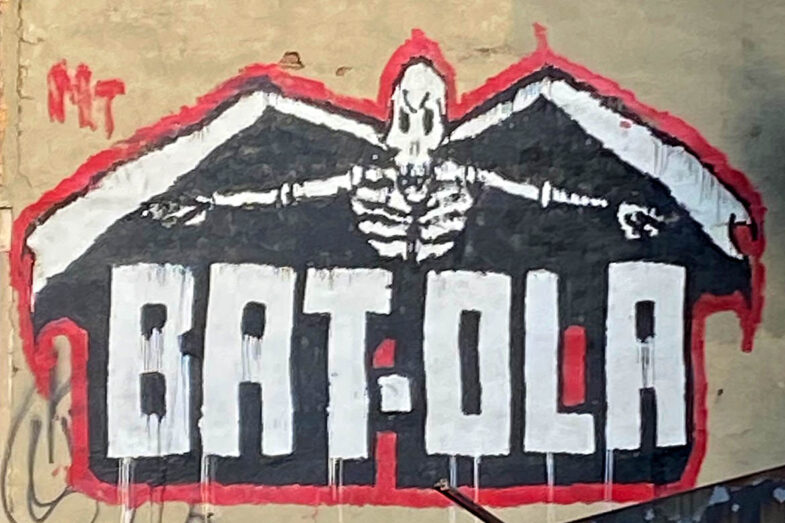
A somewhat obligatory Halloween post this time around which is really just a coincidence. I shoot what I find and sometimes it’s topical. But I digress. I have no idea what this piece is about, but it is quite large. It might be a tag, but it might not given the “MT” in the top left corner. It’s a bit rough, but that can be forgiven as it was probably rushed due to the location. The typography is great and the details in the skele-bat (?) are also well done. Happy Halloween!
West Side, Manhattan.
September 24, 2023
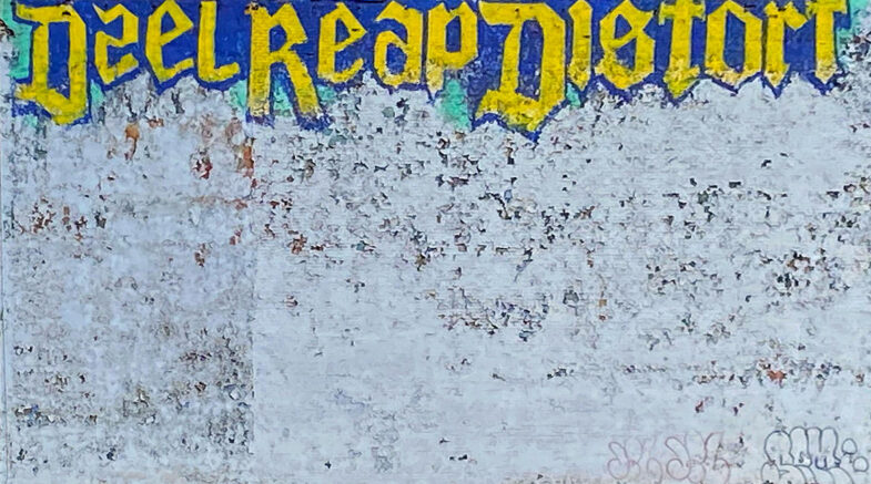
A giant wall piece of lettering notably for the type style and the coloring. You rarely see a blackletter inspired piece these days and gold and purple isn’t common either. Don’t get me wrong — I love blackletter and the coloring works — they’re just not in fashion right now. As for the content, I have no idea. The “a” in “deal” is the real winner here though. It’s both a reverse “s” and a two-story “a” even though there’s a a standard two-story “a” in the next word. A deliberate artistic choice or perhaps just an initial experiment that was rejected by the time they reached the second word. It’s all a bit haphazard, yet still somewhat technical.
West Side, Manhattan.