Books and Shelves
March 6, 2022
TLDR
I love reading. Hence, I love books. All kinds from hardcover to audio to comic to magazine — I love them all. As a child, the library was one my favorite places to visit. I don’t think I’ve ever sold a book after acquiring. Ever. Really.
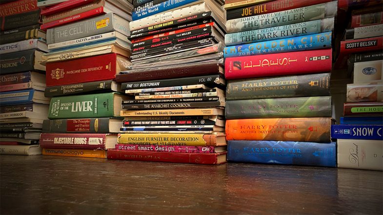
As you may imagine, this means I now have a lot of books. So many books. This wasn’t an issue when I lived in San Francisco and had a huge apartment. I filled it with book shelves and pilled in the books for display and easy access. But when I moved to New York, I knew that the tiny Manhattan apartment wouldn’t accommodate all the shelves or the books for that matter. The books went off into storage because I’d never willingly get rid of them and the shelves got sold, donated or recycled.
Flash forward and now I have a house with plenty of space. Almost immediately, I got all my books out of storage and moved them in. Unfortunately, I don’t have an shelves. Or at least, not nearly enough to hold all the books. Not even close.
So what’s a bibliophile to do? Well, as a temporary measure, I started by stacking them artistically around the fireplace. This was only okay. You can’t really grab a book like on a shelf. You can’t even really find a book. And when decorating a new house, piling stuff up doesn’t really scream “interior design”. It can work in some instances, but in my case, it was just…meh.
But if you’re a designer and developer as well as a bibliophile, you build a virtual book shelf on the web!
This was a great little project that let me play around with CSS grid techniques, design some new branding, work on my Javascript skills and look through all my books. I say “little” project as it naturally grew larger and larger to incorporate a bunch of little features and additions.
Inspiration
Initial design inspiration came from publisher sites like Thames & Hudson and Holloway as I knew I wanted a grid layout with good typography and minimal elements. On the development side, I was inspired by projects like Dave Rupert’s bookshelf albeit to a much less technical level.
Design
As I mentioned, it started out small and very much focused on the design. Typography was easy as I choose one of my favorite families, DIN, but getting the new color scheme right was more difficult. There was a lot of back and forth and experimentation to get the right balance of light tones while still maintaining enough contrast.
Basic content for each card was easy — title and author with a subtitle in some cases — but I also wanted to provide more organizational content as well. Hence adding the small text icons in the card footer to track with the filters in the navigation. As I was entering the info and building out the cards, I also started thinking about linking out for each book. Putting my UX hat on, I realized if I visited and found an interesting book, I’d love a link to find that book online. The hard part was then figuring out where to link to. I started out looking at the Library of Congress, but sadly found the site super confusing. For the comics and audio books, it was much easier. I found a comic price guide site that had a good search, cover images and details. This made it so I didn’t have to take my comics out of the protective plastic to figure out who the writer was. Audio books were also easy as we’re Audible subscribers, so our reading history is already in the system. I’m still a bit reluctant to link to Amazon proper for hardcover and paperbacks though. I’d rather link to a neutral site or a small independent bookshop. I put a pause on that for the moment, but it’s something I’m sure I’ll revisit. The Open Library project (linked below) seems to be the best option for the moment.
It’s worth noting that I did consider adding cover images to each card. In a few tests though, it really just added a level of chaos to the overall design. I was also worried about the performance impact. Hosting each cover image locally would be the way to go, but also presented a massive production challenge to gather and edit them all. Hot linking to a cover was an option via the Open Library, but again, adding the covers didn’t really match the card style. If the covers were the primary design element, I would have designed the cards entirely differently.
Development
Setting up the base CSS grid wasn’t too hard using repeat(auto-fill,minmax(320px,1fr)) to set up a “card” for each book in an <article> element. This also provided the built in responsive behavior so I didn’t have to use any media queries. Very nice.
The grid got a bit weirder though as I started setting up the interior of each card. I first dropped each book’s main info — title, subtitle and author — into a <cite> element to try to be as semantic as possible. The hard part was getting the categories indicators to sit at the bottom of each card. The key turned out to be using a grid on the container <div> for the details and using flex-end on the align-content property. I find things like this the most confusing part about CSS grid — layouts with columns within columns. I’m guessing the new subgrid specification will help with this once it becomes widely available.
It’s worth noting that there wasn’t any consideration on the volume of books or how best to store the data. I just picked up the closest book and entered the information directly into the HTML. The limitations of this approach, while somewhat romantic in it’s old school “let’s not complicate things” way, definitely became more apparent as the amount of books grew and grew. Still, being just text, the HTML file is still less than 500kb which isn’t unruly. If I were to start over. I’d probably drop all the book data into a JSON file to reference. Maybe in a future update I’ll tackle moving the data over to an external file and set up some sort of update interface form.
Organization: A shelf is not a library
While I started this project thinking of it as a “bookshelf”, the more I dug into the details, the more I realized I needed to add in extra information to make it actually valuable. Specifically, categorizing each book type really helps people (and myself) explore the page. So what was initially a bookshelf morphed into what is really a library. Categorization and nomenclature inevitably raises more questions that define the context. Is a graphic novel also a comic book? What about when I have both a paperback and the audio book version? Do I tag the book with both? Tackling each of these questions slowed down the progress a bit.
With general book categories set out, the next step was to create a filtering system and to show/hide the books based on the selection. This wasn’t too hard as they’re were multiple ways to handle it. I choose defining the categories as CSS class names, but I easily could have used data attributes as well. Technically, I’m not sure using empty CSS class names is an appropriate data strategy — as there’s no real styling at all — but it was less verbose than data attributes. I’ve been using data attributes more and more with other projects recently, so maybe I’ll go back and switch everything up in a future update. Seems like they’ll go nicely with the switch to a JSON file.
The filtering script set a CSS “show” class to each card on page load. The show class sets the display property to grid and the opacity to one. Without the show class, the display property is set to none. Of course, we can’t animate the display property, so the effect is a bit of a snap. I included the opacity change as a bit of wishful thinking. Perhaps in the future we’ll be able to animate the display property. At the same time, we also change the active state of the filter button to indicate which filter is in use. This basically just applies a set of new CSS rules to the active button.
Another organizational challenge came as the amount of books grew and grew. Since this project really started as a design challenge with just a few books, I never gave any thought to what it would look like with hundreds of books. Or how it would perform. I was just adding books while watching television or while drinking coffee in the mornings. There was no order at all. Thinking alphabetical by title was a safe way to initially list the books, I grabbed a little script to reorganize them on page load. From there I grabbed the source code from the browser and dropped it into the HTML file. From that point, I used the newly alphabetized list as the master file.
The filters were great, but still left a ton of books in any category. A viewer didn’t have much hope of finding a particular book or author. It was clear that a search option of some sort was necessary. This was easier said than done and I struggled with various implementations. Early attempts had two search forms — one for authors and another for titles. Each triggered on the keyup event without a submit button, but never seemed to work properly. Or rather, it worked occasionally. Sometimes the search conflicted with the filter buttons. Other times, it didn’t find a book on the page. I was never able to really figure out what was causing the errors and put it on hold and focused instead on adding more books.
Luckily, putting down a project is often (always?) the best way to gain the necessary perspective. Happens all the time with design and when I approached the idea of a search function again months later, I was able to get it running with a new form and implementation. This time around I used a single search field and a full page text search rather then trying to scope it to just the title or author content. As mentioned, the search is triggered on keyup which means we don’t need a submit button although I’m not sure I’ve covered off on all the accessibility features with this approach. It’ll need to be revisited with some more testing. One cool thing I read (somewhere, sorry!) was to add in a bit of a delay between the keyup and returning the search results. It makes it a bit less jarring and therefore, somewhat more human.
Of course there is
Now, I was never under any illusion that creating this was a unique idea, but it wasn’t until I was deep into the project that I found a bunch of other full fledged library software options. At which point, I was tempted to give up and see about using one of them. Sure, it would mean putting aside a lot of work, but in theory, a more robust application would provide me with a lot more options in terms of cataloging, updating and maintenance. Plus, creating a custom theme or template for an application is something I’m well versed in doing.
Readerware was the first I found, but it seemed a bit clunky. Yes, I’m being judgemental about the look and feel of the site, but it felt dated somehow. It also appears to be more general — including music and video cataloging — which I wasn’t really interested in. Plus, cost.
BookWyrm was the second I found, and while I applaud it’s decentralized, anti-corporate stance, I wasn’t looking for a social community. The docs even mention that cataloging is a secondary feature and not it’s primary role.
BookStack was the third and best of the apps I found. Free, open source, self hosted and it looks like a great wiki option. Finding it definitely made me throw up my hands and consider scrapping the entire project. The only thing that prevented me from giving it a spin was the hassle of dealing with the server install stuff.
Curation and honesty
One thing I tried hard to avoid was censoring myself. Fifty years of collecting books, sometimes from blind auctions, leaves one with some very odd titles. Even though I sometimes cringed as I found certain titles, I wanted to be honest. Honest as a librarian. It can be hard not to judge your younger self, but I wanted to showcase all the books — all the wild, weird and wonderful titles I’ve read over the years. So there’s some real oddballs in there if you dig in deep enough. I’ve always said “ignorance kills” and didn’t want to abandon that principle just to salve my ego from a bit of embarrassment. Perhaps the answer you’re looking for is in the collection.