The Movies

September 28, 2025

A screenshot of the movie collection web page showing the dark graphics and table of movie titles, formats and genres

Creating a catalog of the movies in our video library

View the project

My wife is a big movie buff and so over the years we’ve amassed a large amount of videotapes, DVDs, BluRays and streaming service purchases. It was way back in 2004 that I first got her a Netflix account as a Christmas gift back when they would mail DVDs to your house based on your selections. It might be the best gift I’ve ever given her as we’re still members after 21 years. We’ve certainly gone through the tech conversion process as well — buying DVD versions of videotapes and then buying digital downloads of DVDs. All of which means we have a mishmash of movie formats scattered around — binders full of DVDs, boxes full of videotapes and digital purchases across a variety of streaming services. It’s a bit of a mess despite her valiant attempts to organize the collection to make finding a particular title easier.

So recently…while I was digging around deep in the archives of some old hard drives, I came across an unfinished attempt to build out a movie catalog for us. From the file dates, it looks like I grabbed a design concept from 2008 and used it as a basis for an initial catalog build in 2011. With the recent (somewhat) build (success?) of the virtual library of all our books, I decided to revive this old movie project and finally to bring it to life.

The Design

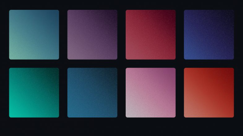
I’ve been kind of in love dark UI color themes recently — grabbing screenshots and building out example palettes for using in some future project. Finding this old design file turned out to be the perfect project to scratch that dark UI color itch and better yet, it came with a preset colors. Turns out long before theme switching became a thing on the web, I was designing dark UI patterns.

The design is a centered, basic table with the data surrounded on the left, right and bottom with artwork. The artwork style is very much of the early 2000s or at least, very much of the style I was drawing back then. I guess you could call sort of a floral trash glitch. Lots of scroll work with tech elements with noise and grime textures overlapped on top. The bottom artwork is a silhouette of an industrial building, but flipped upside down so that the scaffolding and smoke stacks point downwards.

The Development

The two development challenges were converting the old HTML to a modern layout and switching out of the obsolete Adobe Spry framework the original page was using. Keen readers may remember that I used the Spry framework for the retro client list page I created way back when.
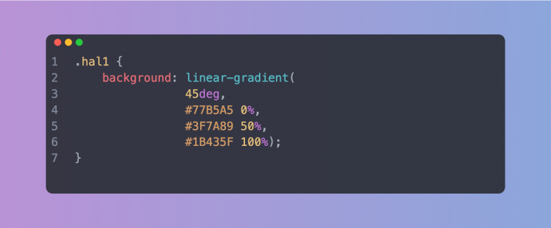
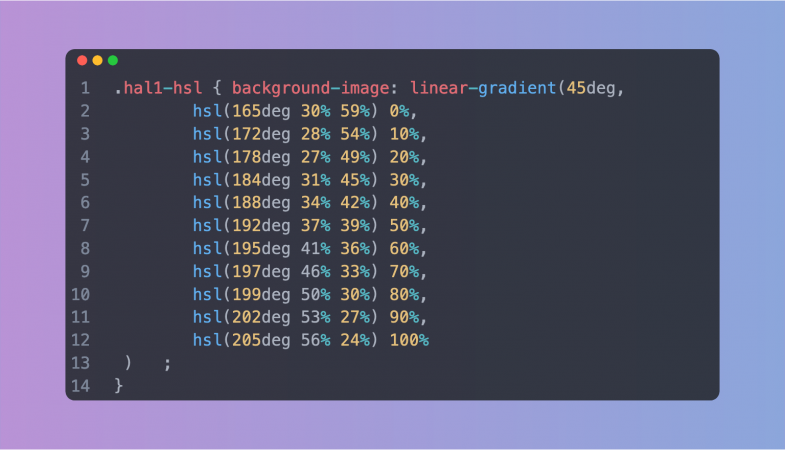
The Colors

Working through all the colors led me down a side quest to create swatch cards for each color. This is not a new idea as I’ve done it before for other projects such as the Pattern Pattern project. This time around though, I wanted to replicate a tool I built for use at work. Namely, incorporating some data attributes and a bit of Javascript to allow for visitors to copy the color values for use elsewhere. Taking it a step further, I converted the hex color values over to OKLCH which is a bit of an aspirational nod to the future (present) to remind myself to really start exploring and using OKLCH values. I’ve tried to make it a bit generic for use with other projects and I’ll probably continue to tweak it and make it a template of sorts. For example, the buttons probably could use some announcement UX improvement.

The Layout

Back on track, I stared updating the HTML structure and layout. The original old file has a single background image. The image pushed the art to each side leaving the middle as a single flat color. The HTML then centered the data table in the center of the page and therefore, on top of the center of the background image. It was a common technique back then, but obviously not relevant today. Centering the HTML on the page is trivial, but updating the layout mean breaking up the single background image. Of course, in the original old files I could only find a Photoshop source file and not the individual illustrations used to create it. Since I wanted to update the raster image to SVG, this led me to reverse engineering the original to convert it back to vector. Maybe someday I’ll find the original files and recreate the complete vector illustration, but for expediency, the new version is not technically identical to the old version.

The Typography

The original used Arial because custom fonts and font loading were in their infancy while services like Google Fonts weren’t even available. System default font stacks were still the quickest option for little projects like this concept. The one trick in the original design was to reduce the type size of Arial significantly which gave it an almost bit mapped or mono space appearance. For the new version, I took this visual quirk and better defined it by switching to an actual mono space font, specifically one of my new favorites, Space Mono. It’s still small to help maintain the look and actually works better as the characters forms are more legible increasing readability and accessibility.

The Content

With the graphics, layout and basic HTML structure updated and in place, it was time to get the massive list of movies into the HTML table. It only took a few minutes of copy pasting movie details into HTML blocks, duplicating the HTML and repeating it all over again for me to realize the manual process was too cumbersome for me to ever finish the project.

So what’s the solution? Like any good craftsmen, it’s to build your own tools, your own jigs. It’s a common enough approach in the carpentry and the idea is finally coming around to web development. Here’s a good post about the connection between craft, tools and jigs and another post with an example jig a designer built for their use. I can relate to both posts as I’m now finding new little parts of the design/build process that need a custom tool or jig to make things easier (and often better). Realistically, I’ve been doing this forever. Every time, you learn a new code pattern, you often reuse the pattern elsewhere. Code building upon code. The color swatch panel is an example. I made it for one specific use case, but I keep finding other opportunities to use it as well as continuing to tweak the features.

In order to speed up the data entry, I built a form. A regular old HTML form with some PHP to handle the inputs and dump them in to a JSON file. This was the jig, the single purpose tool to help me craft the final output. With the form up and running, things became much easier. I was able to flip through binders of DVDs and then tab through the form fields to quickly enter the data. I kept a browser tab open with our Prime video account so that I could jump over there to figure out a movie genre, double check spelling or look up a title. It was a tremendous time saver to say the least. Using the form got quicker with each entry as the browser remembers previous inputs and then allows you tab through the entries. After a few times, I didn’t have to type in the genre anymore, but merely tab through the browser suggestions. Super quick and easy.

For testing, I wrote up a script that took the JSON file and generated the HTML table. This helped catch any errors and typos before they got hidden too deep in the list. Of course, the page was then dependent on the Javascript. No Javascript (due to loading error or visitor setting) and then there’s no table. For the final production page, I took the testing page live output and copied the entire table, pasting it into a new HTML file. This extra step keeps the page static eliminating the table build step. The only Javascript then is for the extra functional upgrades and if it doesn’t load, the table data is still available. This also let me alphabetize the list by title prior to creating the new static page which was handy as the data as originally entered was anything but organized. And yes, that does mean that the build process for this static page is…me, building the page. I’m the build process.

Sadly, I do have to add an aside here: “building your own tools” is not a “website builder,” “vibe coding” or any other artificial “intelligence” no code bullshit. I hand code the tool to help me hand code the output.

The Upgrades

As the list got longer and longer, I took the opportunity to add a few features to help my one potential user, my wife, find a film. This meant two upgrades: search and sorting the table by columns.

The search was a modified version of the one I built for the virtual library. Again, another example of reusing (and modifying) a code pattern for a new project. For this version of the search, I switched from using data attributes to just the text values of the table cells.

For the sorting, I’m not sure where I dug up the script, but it’s certainly a pattern I’ve used before in other projects. Nothing fancy, just a little text comparison, but definitely can help with such a long list.

Summary

Overall, it’s nice to get this project up and running to bring this design to life. I find there’s something really attractive about the table cell separation. It just feels…right. A bit of extra polish for an otherwise ordinary table. The same is true for the mouse over / hover effect on the table rows. It doesn’t do anything, but it’s fun. It’s almost a functional deceptive pattern although I wouldn’t go that far. The cursor doesn’t change indicating a hyperlink and the text itself can still be selected. But it’s a fun highlight effect that might help with readability. It also fits with the retro style. I can almost hear the small beep, chime or click sound as you move up and down the table rows. Hmm…maybe I should add in a sound effect and some tab key navigation in the next revision.

View the project

Unsmiley: Part 2

June 15, 2024

Revisiting an old project to create a showcase for the illustrations.

FYI: Here’s the original blog post about the project.

An emoji icon from the Unsmilely set. It is a circle with the left eye as an "x", a curved smile lip in the lower left and an exclamation mark as the right side of the face.

As I build out single page sites for projects, both new and old, I remembered this emoji icon set was only really hosted over on Codepen. Yes, you could download the icon set from the original blog post and yes, you could even see the animation inline via a video or the Codepen embed, but it wasn’t exactly a showcase. I really like having these little single page projects, so naturally, this one deserved the same treatment.

View the project showcase.

Design

Color scheme is still using the Flexoki palette I’ve been obsessed with, but scaled back to be very minimal. The key color update was to adjust the icons themselves. The originals were in pure black and white. For the showcase, I removed the white backgrounds to let the warmer, paper tones through as well as adjusting the blacks to be a bit softer.

Fonts are inspired from the main site and the blog, so DIN 2014 for the body copy (condensed) and Titillium Web – Black for the headings.

The layout is also fairly true to the setup of these other projects, but with a couple of updates. I removed the main site link text subhead from the header and instead, dropped in my logo (with main site link) into the footer. This was one of those, “now that you see it, it’s the obvious solution” moments. Of course, the main site link should be in the footer and of course it should be via the logo.

Development

Nothing dramatic in terms of the layout as again the CSS grid sets up all the responsive container items. There are a few updates to the original emoji CSS as well as some new ideas incorporated. One interesting little bug was discovering that the CSS for the responsive positioning within each emoji was conflicting with the page CSS grid. At certain breakpoints, the emojis were busting out of their grid containers. Adding a couple of media queries to reduce the CSS variable used for the emoji sizing units seems to have cured the issue, but honestly, I didn’t spend a ton of time obsessing over breakpoints. I checked a few sizes based on Macbook viewports (from the awesome screensiz.es) and then moved along. It allowed me to take care of a dev chore I’ve been putting off — adding those custom viewport sizes to my Firefox dev tools. A little gift to future me when debugging sites and needing to see additional viewport sizes.

I also realized that the original animations were all set to only play once on page load. That was fine for the Codepen, but on this new page layout, the animations were often off screen meaning you might not even see the animation happen. Adding a replay icon button was a quick solution. It works great, but admittedly uses some hacky Javascript. There are definitely better ways to code it, but whatever, it works here. It also led me to learn more about the limitations of CSS animations and there’s certainly more to learn as I go forward.

The other development update circles back to the philosophy of “owning your content” which is the whole point of creating this single page in the first place. Yes, the original blog post did show some of the art, but the animated versions were all hosted on a third party service — Codepen. Now, even if you like the third party service (and I do like Codepen), there is always the chance the site will go down, get sold to venture capitalists or more recently, start stealing your content for AI. All of which are beyond my control and in the end, only serves to cause me future headaches.

Contrary to all of that of course, is the fact that I’ve also added the code to my Github account. Yes, another corporate third party site. As antithetical as that is, it doesn’t dilute or detract from the project page. It was really just an effort to start learning more about Github. I use it daily for work of course, but in a narrow fashion. Bulking up my personal Github account with more repos will (hopefully) get me to tinker and learn more about it. It’s definitely one of those powerful, yet opaque technologies.

All in all, I’m happy with the outcome and more importantly, glad to have it showcased here on my own site, in it’s own page.

View the project.

Pattern Pattern

May 11, 2024

Drawing (and redrawing) the patterns from some old favorite clothes.

View project page

Two repeating patterns, side by side, both drawn from old textiles

Digging around the dusty corners of an old hard drive when I came across a pattern I had drawn way back when. The pattern on the left was actually from one of my favorite 1950s style jackets. I don’t know where the jacket went, but I do still love that pattern. The one on the left is from a shirt I still own. More on that pattern later.

When these were originally drawn, I did them in Adobe Illustrator and saved them as Illustrator swatches which is kind of telling as to how long ago it was. Repeating patterns as swatches were new and exciting and Illustrator was the main tool of choice in my work. There wasn’t a whole lot of web design work back then and print ready vectors were mandatory.

Like a lot of my recent archive discoveries, once again, the project was how to update these files for the web.

The Design

Since the patterns were originally swatches, I used that idea as the main design feature. I’ve been creating a few varieties of UI cards for work, so I had a head start on what I needed. Card interfaces are all over the web, but I definitely wanted these to be closer to Pantone or paint chips. There’s a couple of different card options to show the pattern specs, the full repeating pattern and then the individual colors.

For the typography, I wanted something a bit retro to reflect the 1950s period, but without looking too stylistic. I also wanted to branch out from the usual sources and find some new fonts. Being able to self-host the files and if possible, use a variable font were also on my requirement list. Luckily, I found everything over at Fontshare. The main heading is set in New Title and the subheads are set in Clash Grotesk. The really narrow letterforms of New Title definitely had that retro feel I was looking for. I’m also still completely enamored with big chunky sans serif faces, so Clash Grotesk definitely caught my eye. All the rest of the text is set to a general system sans serif for speed and ease (or laziness while coding if you like).

For the colors, I’m still stuck on using the Flexoki palette as I love the warmer print-like tones. Once again, I didn’t really use the full palette, but that’s okay. I also didn’t go overboard and create multiple color themes. Just dark theme for this page, thank you very much. Now, the colors used in the patterns themselves are not from Flexoki and were eyeballed from the clothes themselves as part of the drawing process. It’s also worth noting that the color names used in the patterns are totally made up marketing copy. They’re not accurate in any way. I just wanted some fancy titles for them. Use the actual color values if you want to replicate them.

The page design is also the same basic template I’ve been using for these little projects: header, main, footer. Nothing crazy as it let’s me quickly get to the fun stuff.

The Patterns

The quickest way to get the patterns ready for the web was to export them out of Illustrator as SVG files. Add in a bit of compression and optimization and the SVGs were ready. I’m using the plural “patterns” here, but I should clarify. The whole project idea started when I found the first jacket pattern, but as I started working, I found I had previously drawn another textile pattern back in 2012. This was the shirt pattern. Turns out my love of patterns has taken many forms. Even though I had blogged about the shirt pattern, I had only provided it as an Illustrator swatch, so including in this new page seemed like an obvious next step. Creating SVGs for the web is pretty standard fare these days and while it’s one of my favorites, I did want to push things a bit further. Hence, some code exploration.

The Code

General page design is still based on a responsive CSS grid with three columns and a few column/row spans for the larger cards. Nothing fancy. The real challenges came when I started looking closer at the jacket pattern. It’s essentially a pixel pattern — which made me thing of a grid pattern — which made me think of CSS grid — which made me do something silly. I created the entire pattern as a CSS grid with each cell representing a pixel on the pattern. Of course, the pattern is 17 x 17 for a total of 289 squares.

(Why the original pattern was 17 x 17 is beyond me, but it made the math more painful than necessary. I actually typed up a cheat sheet with the numbers for easy reference.)

Yep, that’s right. I created a grid with 289 empty <div> elements. Genius, I know. I then set up background colors for the red and black squares with a massive list of :nth-child() statements. Being responsive, it does get squashed when the viewport is resized, so beyond the insanity and performance issues with all those DOM nodes, it’s not an ideal method. The SVG is still better.

Just because it’s possible, doesn’t mean it’s a good idea. But knowing that didn’t stop me from trying another crazy idea. I’ve been playing around with creating background images with multiple linear gradients. Knowing that we can create hard lines between colors with stops in the gradient, I set out to draw the 17 x 17 jacket pattern as a gradient. This method, like the massive <div> list, was an effort in persistence. Getting the pixels lined up was a complete pain, not to mention all the sizes for the 17 gradient rows, but I did learn a bit more about these complex background images. I even went a step further and created a version of the gradient using percentages instead of pixels. This certainly helped and brought closer to the CSS grid version in terms of flexibility, but also the same limitations. In the end, I didn’t even include an example of the gradient on the page although I did keep it in the CSS file for reference later.

Learning all those lessons, coupled with the more intricate pattern of the shirt, I didn’t even attempt either a grid or gradient solution for the second pattern. It might be possible, but after all that experimentation, I didn’t have the patience for more.

Overall, I’m happy with the lookbook design and chip cards. Getting these old projects some new life in a new format is always fun too. Head on over check it out and download the pattern files.

View project page

From Screen to CSS

March 27, 2022

A sample of the UI color gradients from 2001 A Space Odessey

Creating CSS Gradients of the UI Screens in the movie 2001: A Space Odyssey

View the gallery and download the style sheet

Inspiration is a weird and wonderful thing. When it strikes, it generally locks in and will not let go. The idea keeps coming back around in my head and regardless of whether it fully comes to fruition, I have to chase after it.

Last week, I randomly came across a showing of the epic science fiction film, 2001: A Space Odyssey. As a science fiction fan and lover of the movie, I settled in to watch it again. Whenever you re-watch a movie, you’re bound to notice new things and this is especially true with a movie like this one where there is very little dialog and hardly any background music (apart from the classical pieces). There’s just so much open silence that you tend to focus in on other details.

What struck me most (again?) was the user interface screens used throughout the station, ship and pods. Now, the HAL 9000 is fairly established as a cultural reference and although the astronauts mostly interact with HAL via voice, it’s these UI screens that display information. The movie is such an epic force that it’s been dissected many times before by folks smarter than me so I won’t go into all the myriad details of things such as the typography. (Okay, maybe just a little bit of typography goodness later on.) The important thing I really focused on in this latest viewing was the color of the screens.

Each screen — and there are multiple displayed at a time — has a subtle, unique color gradient background. Reds, blues, purples, greens and grays. I’m not sure how the colors relate to the information or purpose, but there’s both a vibrancy and softness that I’m fascinated by. Part of it is probably the contradiction between the film trying to look futuristic while using 1960’s technology. Long before LCD screens, long before flat panel screens, long before high density displays, the film was attempting to predict what a user interface “screen” in a space ship would look like. And yet, it does an excellent job. The actor hairstyles feel more dated than the screens!

As I’ve mentioned, I’m a big fan of the movie, so over the decades I’ve always taken an interest in screen savers, desktop backgrounds and illustrations related to the movie. For me, HAL is a great foil for our modern relationship with our computers. Heck, my laptop crashed just today for no reason at all that I, as a mere human, can discern. All that was missing was HAL saying, “I can’t do that Dave.”

So with my interest in the movie art direction piqued once again, I was inspired to dig around find out more.

Concept

My idea was to recreate or capture those colors in a modern way, specifically in the way I’ve been focused on for work. I’ve been doing a ton of work on color for the web and with a bunch of new color models coming online soon, the way we see (and create) color on screen is going to change significantly. My idea was to use what I’ve been learning about CSS color to create a style sheet of color gradients to try to capture that magnificent soft glow of those science fiction screens.

Research

My initial research was driven by a memory. You know that thing where you remember seeing something online, but you can’t remember anything else? There should probably a new word for this phenomena. As I recall, there was a designer who created desktop backgrounds based on those screen colors. But…of course, I couldn’t remember or find anything in my searches.

The first project I did find — the HAL Project — is one of the old school originals. I do remember, the original screensaver as being tons of fun and using it at work always generated a ton of positive responses from scifi geeks. Looking it up again, it’s expanded into tons of materials which is awesome, although not quite what I was hoping for. Beautiful illustrations and typography, but flat color and more about detail than fidelity to the original.

Next I turned to a bunch of the UI and scifi blogs I love until I found the reference shots I was hoping for — actual screenshots from the movie itself. With these at hand, and finding nothing comparable to my idea, I was ready to try my hand at bringing these colors to CSS.

Process and Production

With references in hand, I began gathering pixel reference color samples to start building out the gradients. Starting with the basic HEX color space, I pulled three color samples for each screen: light, mid-range and dark. With those three values, I built out the initial gradients.


An aside on color and gradients

For years, creating gradients has always been difficult. Back in the day, creating a gradient in Photoshop or Illustrator was an effort in patience, often with poor visual results. Banding was a common problem leading the gradient to appear chunky instead of a smooth blend. A proliferation of tutorials featured various techniques and methods to achieve that holy grail of a beautiful seamless gradient.

Beyond the software, you also have differing color gamuts. Things that work in print, look horrible on screen (and vice versa). Even within each discipline, you have competing color models. Ask an experienced designer about color and you may get a long sigh. I still remember getting a “web design” from a print designer that used the completely wrong color space for the web. Every single color had to be converted and I had to explain why to the client.

Flash forward to today and you have multiple ways to write color values for the web. The long standing traditional methods of hex and RGB values are showing their limitations as new fancy monitors and screens are capable of displaying a wider range of colors. Gradients are an area where the RGB color space is showing its age leading to what some have called, the gray dead zone. Fixing this issue involves adding more stop points in the gradient and often times using a different color representation like HSL.


The idea was to set up unique CSS class names with a background attribute using a linear-gradient. Keeping it simple, the light color is set a 0%, the mid-range at 50% and the dark at 100%. Looking at the movie scenes, I settled on a direction of 45 degrees. I also set the class names as “hal” with a number in a nod to the movie.

Code sample showing the basic CSS class name and background linear gradient

Previewing them in the browser lead to multiple rounds of finesse to repeat this process to eliminate any banding and smooth out the gradients.

Something’s Not Quite Right

Getting the first few gradients smooth and looking good was great, but they also looked a bit too good. There was a lack of vintage to the colors. They somehow didn’t feel quite right. The solution was to create a couple of additional classes to add in some noise — just a touch to try to mimic the low resolution monitors used in the movie. The basic noise was created in Photoshop and exported as a small PNG tile. Since I wanted the final style sheet to stand on its on (and be ready to use), I ended up Base64 encoding the noise PNG file and dropping it into the CSS as a background image on a pseudo element of the class. It does make the CSS file significantly larger, but there’s no additional image file necessary (or to get lost). The noise was okay, but it still needed some finesse. Reducing the opacity, adding a bit of blur via a CSS filter and then setting a mix-blend-mode helped to make it more subtle. Of course, in dealing with blend modes, what works on a light color didn’t quite work on a dark color. This lead me to create two noise classes: one for dark gradients and one for light gradients, each with a different blend mode.

Code sample showing the CSS for the noise classes

Different strokes, different folks

With both the basic RGB gradients and the optional noise additions in place, I began thinking about re-creating the set using HSL (hue, saturation, lightness) color values. Why? As mentioned in the aside above, different color modes along with additional color stops can help create a smoother, better looking gradient. In working with color and gradients, I’ve definitely seen some dramatic differences. Plus, it gives people the option to work with, and customize, the set that they like best. So how best to do this? Luckily, there’s some wonderful tools out there to help. I ended up using this tool with eight color stops in a straight linear curve. These new HSL gradients were added into the style sheet. Since I had spent so much time getting the RGB versions as smooth as possible, I didn’t see a tremendous difference with the new HSL values, but you can be the judge.

Putting it all together

With the gradients looking good, I started having fun with the page design to really capture the spirit of the movie. The gradient swatches were set up using CSS display:grid and setting the columns to repeat(auto-fill, minmax(200px, 1fr)). This fills the parent container with swatches as long as they are a minimum of 200 pixels wide. Short and sweet, automatic responsive behavior. The columns contract and stack as the screen gets smaller. I set a small border-radius on the swatches to help them mimic the shape of the monitors in the movie, added a bottom margin for spacing and the swatches were set. It was then just a matter of replicating each swatch <article> with the appropriate CSS class.

The colors for the rest of the page elements were also pulled from the movie stills. The page background, the type color, the button colors — all are from the movie — albeit adjusted a bit to make them more harmonious with the overall design. Nothing fancy with the color modes here, just the basic hex colors sampled from the stills.

The typography was another fun aspect. The type choice was never really a choice as the movie (and many other scifi films) uses Eurostile almost exclusively in the ship screens. I used the extended variant of the typeface and transformed everything to all caps using CSS. But once I had the type set up and the text in place, it still didn’t look right. Or to be more precise, it looked too right. It looked like a modern page. The text was sharp and crisp which didn’t reflect the time period or the technology used in the 1960s. The answer was to add a tiny bit of blur via the CSS filter:blur() property. This really brought the overall design to life. The whole thing really started to feel like a vintage CRT screen. It really is all about the subtle details to create the feel of a project.

Overall, I think it looks great and I’m happy with the final colors. Is it useful? Maybe not, but perhaps you’ve got a project where you need some nice gradients. Or perhaps, you’re just a scifi fan and this is a good reason to watch the film again. Either way, I’m glad I took the time to add to the movie’s legacy in some small way.

View the gallery and download the style sheet

Unsmilely

January 24, 2021

Update: I’ve revisited the project and created a showcase for the icons.

Unsmilely Icon Set

There’s a natural ebb and flow to projects. An initial burst of inspiration creating momentum that slowly fades as the hard work and all too often, the insecurity sets in. This is one of those projects.

Originally drawn in 2017, it’s hard to recall the exact source of inspiration, but in hindsight, they seem a reaction to both the political landscape at the time as well as the sugar saturation of skeuomorphism in the standard emoji world. Like in my symbology project, these are a study in the reduction of the extraneous to reveal the core.

I think the other goal, given their simplicity, was always to animate them. The only question, and this is where the project ebb started, was how to best create the animation. And so, what started out as an excuse to learn new software applications — a tedious task which sucked any joy out of the project via frustration — led to stagnation. It was only recently when my web work sparked the idea of animating these via CSS. Now, there was still a ton of learning to do with this CSS only approach, but at least I had a stronger foundation having done it before with small things and these icons are in essence, a gr0up of small things.

Here’s a quick video demo of the animation.

And for those more inclined, here’s a Codepen with all the HTML/CSS.

See the Pen
Unsmilely Icon #1
by strongest (@strongest)
on CodePen.

The full collection on Codepen is available here: https://codepen.io/collection/XjoBzV

Or download the complete set to get the images.

Bad Form

September 16, 2011

Bad Form


In these heady days of web design and development, with multiple screen sizes, tablets and smarphones, it can be difficult to get proportions and spacing correct. Of course, one would expect a major retailer to have the resources (and care) to get it right. This screenshot was taken on my laptop with a resolution of 1440 x 900 running Firefox 5 on OSX. Nothing too crazy in terms of a web user profile.

Beyond any aesthetic issues with the check box label being too far to the right, the functional issues (or non-functional as the case may be) are what should be of primary concern here. I suspect many users would stumble over connecting these two parts of the form. If it takes folks an extra few seconds to fill out your form, it takes away from the shopping experience and therefore it impacts your brand.

Will it take away from sales? Maybe not initially. I certainly continued with my purchase, but if users are left remembering that the checkout process was annoying, weird, or heaven forbid, difficult, they may be more likely to head to your competitor’s better designed site.

Small improvements can build up to increase satisfaction and in this case, it seems like an important (and easy) fix – especially as this is one of the very last steps in the check out process – right before you click the “purchase” button.

Seems simple enough – in both common sense and in design – but the evidence is clear.