Empire

March 13, 2021

With The Expanse in between seasons, we’ve gone back to the Star Wars franchise to get our science fiction fix. And while we work our way through The Mandalorian series, we pulled up Rogue One the other afternoon just to take a break from all the cuteness of baby Yoda. Nothing like a tragic tale of death and sacrifice to clear out the sinuses. Somewhere in the middle of the movie, I came across this symbol and headed down the rabbit hole of Star Wars art and iconography.

Now, ever since the early days, the franchise has had great art direction and a good set of icons — from the circular Empire symbol to the Rebel Alliance logo. Simple, recognizable and emotive. As a side effect, they’re easy to reproduce which has led to a ton of mommy blog crafting posts with customized merchandise.

Given all this, I was surprised when I saw this logo in the movie — one I can’t remember seeing before. In the mission on Eadu scene, the Empire science officers who are developing the Death Star are all wearing white jumpsuits with this logo patch on their upper arms.

Star Wars Rogue One Empire Science Officer Logo

For me, it’s the perfect symbol for the Death Star. It communicates the basic shape along with the firing mechanism. So I had to draw it up quick and you can download the icon here.
 

Toothpicks

February 27, 2021

Everyone is in a lot of calls these days. Phone calls, video calls, teams calls, zoom calls. We used to have meetings and now we have calls. The traditional way to stay alert (or to kill time) during a meeting, is to doodle. And for years, this was my preferred way to go through a meeting. I’m a prolific note taker, so doodling in the margins (or the whole page) was just another “note” in my mind. Like many designers, I’ve got notebooks full of doodles, some of which have revealed great ideas, cute illustrations or other worthy gems.

But now, my notes have shifted to text files, so there’s no more doodling. A sad side effect of never leaving my laptop behind for a meeting. In the before times, I’ve always preferred a hard copy notebook over any electronic device. It was a nod of respect to whoever was leading the meeting — sort of like leaving your smartphone face down (or never taking it out). It announces that I won’t be actively doing something else while I should be paying attention to the meeting. Maybe it’s generational.

So while I’m now no longer drawing in the margins, I’ve found myself — quite by accident — creating little mini sculptures during my meetings calls. After snacking on something at my desk, I end up chewing on a toothpick which acts as a kind of fidget spinner to distract part of my brain while I focus on design, coding or whatever is being said on the call. At some point, the toothpick will break and I’ll put the pieces down on the desk and start arranging them.

It all started innocently and unconsciously enough, but soon I was actively in the creative process and rearranging little pieces of wood again and again. It was really just an exploration of shapes and color in a sort of 2D/3D mix. I think the project has run it’s course and I’m done with these, but we’ll see how it goes. Maybe I should redraw the set? Here’s a video showing a bunch of the individual sculptures.


Note: No flies were hurt during the making of this film. The fly was not alive when I took the photo. I think it died of old age. I just found it’s corpse the integrated it into the sculpture.

Finally, I love toothpicks and could write an entire post about them, but let’s just leave it as: my favorite toothpicks are party picks.

Understanding

September 19, 2020

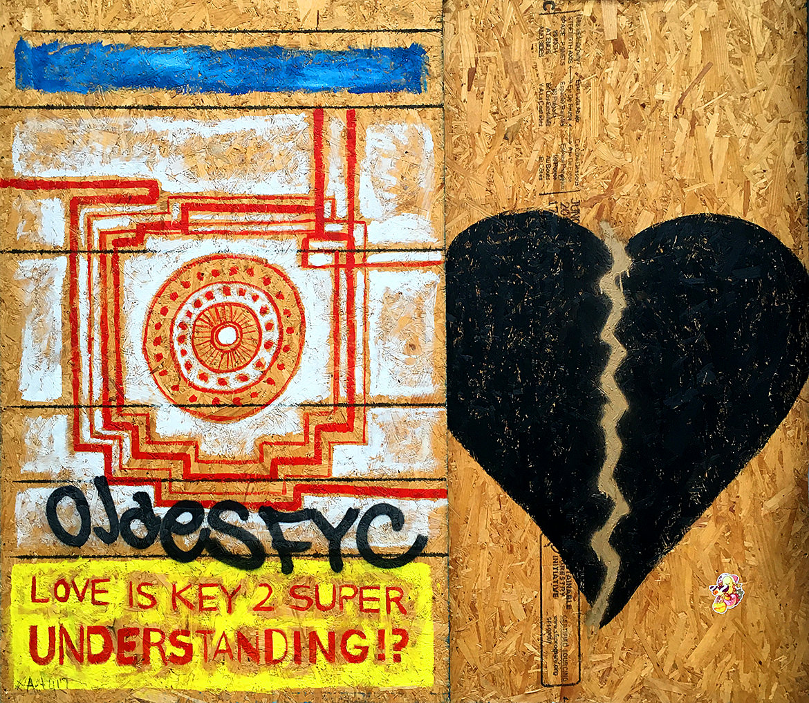
Spray paint graffiti of a pattern and a broken black heart with the phrase, "Love is key 2 super understanding"

One final piece from this pandemic plywood series. This one with a mix of things going on — the blue cover up, the pattern, the tag overlay, the phrase (stenciled?) and the broken black heart. A good use of the plywood as a reversed color in the pattern versus the heart where instead of drawing two halves, it’s a single heart split with gold. Perhaps that’s the whole point — the pattern of whole things broken and super understanding.

Soho, Manhattan.

We All Need Change

September 5, 2020

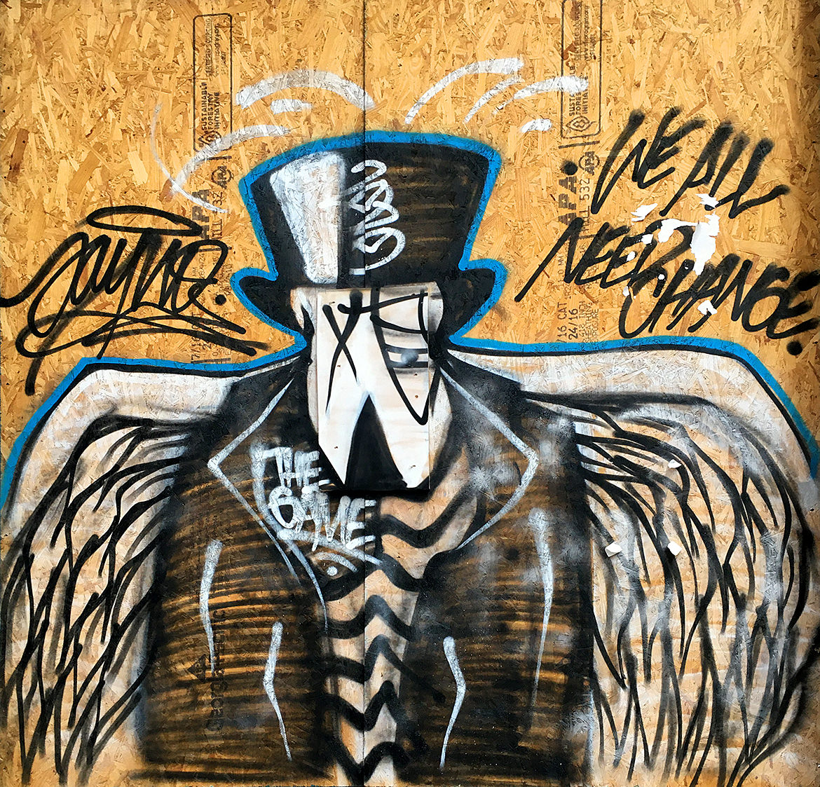
A spray paint cartoon bird wearing a black suit jacket, top hat and striped shirt with large white wings.

The pandemic provided fresh new canvases along with the quiet streets to paint. This piece is a bit sinister as it conjures the grim reaper, the angel of death calling for change. But change is often hard and we do resist. Perhaps that’s why the call comes from the dark. And is that a monocle? Somehow my brain says yes.

Soho, Manhattan.

Jamming

August 29, 2020

A large single line illustration in white on black of jazz musicians performing

A very nice single line piece with all the fluidity and style you could hope for. Look again to see all the details. Single line work like this has a confidence in vision. It’s like the city is reclaiming itself.

Soho, Manhattan.

Fear No More

August 22, 2020

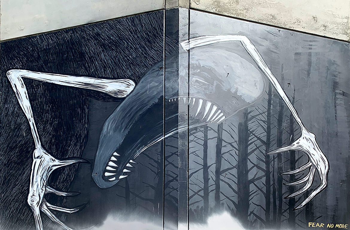
A large painting of a monster with mouth open, sharp teeth and claws grasping in the night forest

Another guest post from the west coast this week! Our roving reporter (@hopemanbob) sent this painting along. The application is superb as getting a concept to work around a corner is very tricky. After a little research, it looks like the original had more at the bottom that’s been defaced (and hence cut from this shot). View the original from @vivacheman for the context — it really brings home the title.

Oakland, California