We All Need Change

September 5, 2020

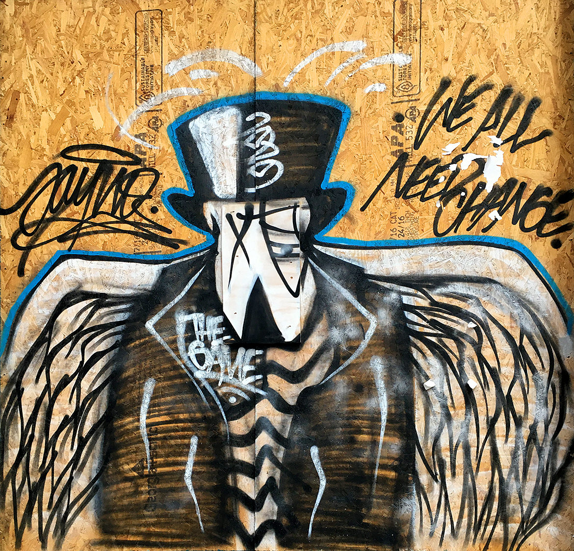
A spray paint cartoon bird wearing a black suit jacket, top hat and striped shirt with large white wings.

The pandemic provided fresh new canvases along with the quiet streets to paint. This piece is a bit sinister as it conjures the grim reaper, the angel of death calling for change. But change is often hard and we do resist. Perhaps that’s why the call comes from the dark. And is that a monocle? Somehow my brain says yes.

Soho, Manhattan.

Jamming

August 29, 2020

A large single line illustration in white on black of jazz musicians performing

A very nice single line piece with all the fluidity and style you could hope for. Look again to see all the details. Single line work like this has a confidence in vision. It’s like the city is reclaiming itself.

Soho, Manhattan.

Fear No More

August 22, 2020

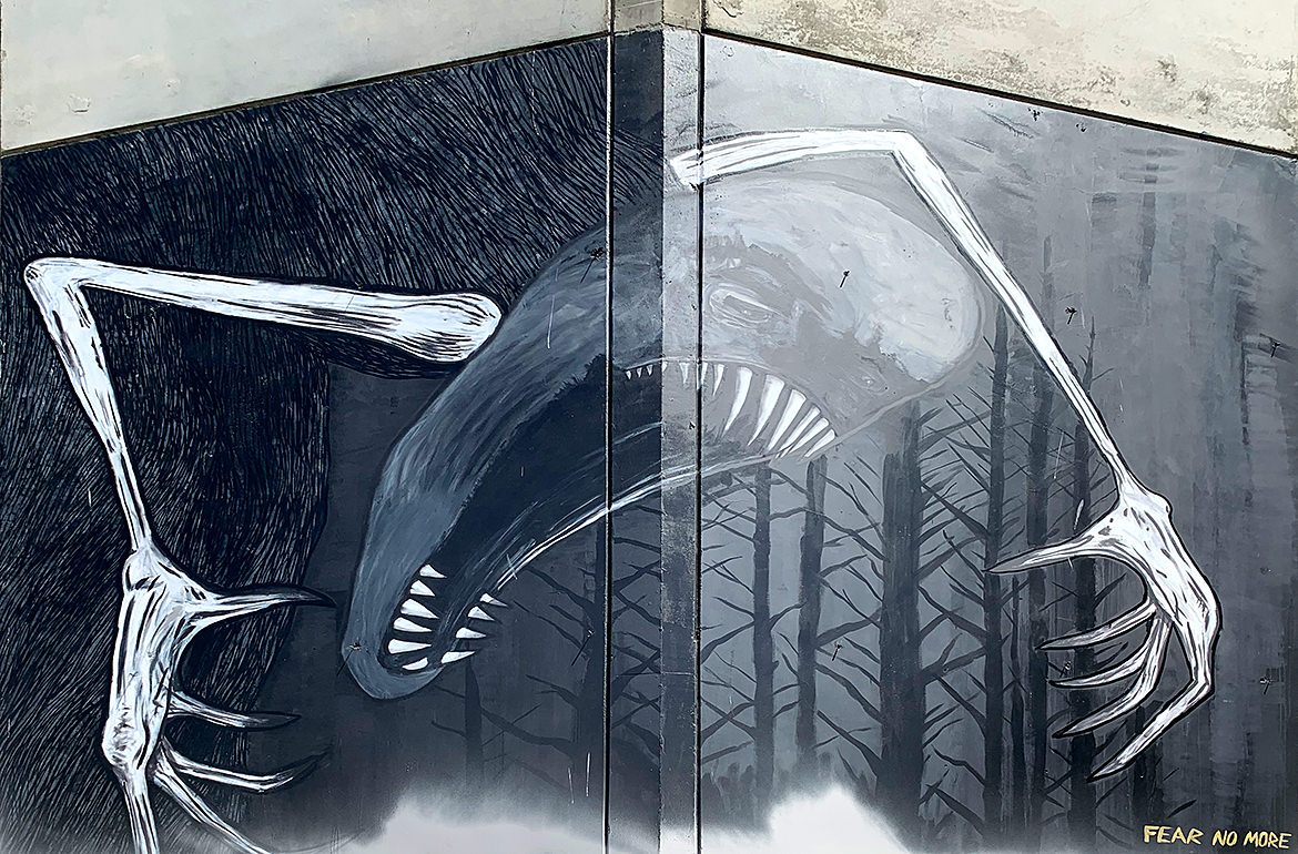
A large painting of a monster with mouth open, sharp teeth and claws grasping in the night forest

Another guest post from the west coast this week! Our roving reporter (@hopemanbob) sent this painting along. The application is superb as getting a concept to work around a corner is very tricky. After a little research, it looks like the original had more at the bottom that’s been defaced (and hence cut from this shot). View the original from @vivacheman for the context — it really brings home the title.

Oakland, California

Four Hearts

August 15, 2020

A series of four graffiti hearts in different color schemes each with line work inside

I was forced back into the city last week (which was weird), but naturally, I took the opportunity to capture some more art. This shot has two things I love — a good series and nice line work. Exploring different color scheme options live across the boarded up windows of a construction site is bold. And the line work falls somewhere between a science fiction alien language and the shapes of Arabic typography. From @7lineartstudio

Soho, Manhattan.

The Symbology Project

April 11, 2020


This week I’m taking a little time to (finally) write up a summary of an old personal illustration project from my Instagram feed.

The Background

Early on in my design career, I used the first hour of the day to draw something — everyday. As I was learning both about illustration and the software, I usually chose to recreate something I liked. Back in those days, it was probably one of the great promo illustrations from Charles S. Anderson for French Paper. These had a mid-century modern feel with a cartoon edge and some humor coupled with great details.

Flash forward many many years and I found myself doing less hands on illustration due both to career advancement and a lack of time (which were linked). Reminiscing on those early days, I wanted to get back to drawing without a brief, client or project — just drawing for my own sake.  Luckily, I was able to take a sabbatical from work to relax and recharge which gave me all the time I needed. There was no real plan other than that — I was just going to start my day, everyday, with a coffee and an hour of drawing.

The Inspiration

As a science fiction fan who read too much and grew up with the first video games, it didn’t take me long to find inspiration. My wife and I had been playing a bunch of Destiny and I found myself, as I do in many situations, looking closely at the user interface details. Those little items that somehow bridge the gap between typography and iconography to communicate meaning. I’ve always been fascinated with this translation of symbol and meaning, so it’s no wonder I found myself working in design, branding and UI/UX. In video games, these small details help build the world while serving the dual purpose of being recognizable to the players with tangible, functional meaning. I also think that the nature of science fiction, the duality between science and fiction, is engaging for me. It’s unknown, new, futuristic, off world and yet paired with a level of precision and rigor which spurs my curiosity.

The Illustrations

Looking at all these details (and having worked with video game companies), I know how much work goes into everything, even things you think are simple or that most people gloss over — all of them are crafted. I wanted to understand what went into these drawings, the shapes and the lines. I set myself the task to pick out elements and to redraw them, but to reduce them to their most basic parts. It was sort of like trying to get to the core of their meaning by stripping away the game story and context. No fancy textures, renders or even gradients for that matter. Just the element in two or three flat colors, out of context and standing on it’s own. No explanation or description.

With the project outline in mind, the rest was fairly straightforward. It was just a matter of paying attention while playing, taking a quick screenshot and then using that as a reference for color and shape. Any Destiny player, will immediately recognize many of these symbols proving that even detached from their original art, story and context, their meaning still translates. And yet, there are also many that players wouldn’t have noticed — ones that they’ve probably seen a million times, but never focused on.

The first run was about a dozen symbols during my sabbatical and I found it immensely satisfying to study the symbol construction in terms of art while thinking on how they construed meaning. I don’t think I even published them to Instagram, but just stashed them away in a folder. Once back at work and with the daily grind pushing on my time, I put the project aside for a while as I got caught in other things.

But I found myself missing the simple, quick process of drawing each symbol, somehow capturing it’s meaning and essence through drawing it. I think it’s probably similar to learning how to write, when you first grab a pencil and start drawing letters. And the Destiny game itself did not stand still. It released new expansions which lured me back into playing. And that in turn, led me to revisit the project with new vigor. I drew every weekend and started posting them on my feed. I eventually put down my controller (for health reasons, not for any love lost for gaming) and the project sputtered to a halt. By that point though, I had drawn 121 symbols and was ready for a new challenge.

You can see them all in the video above or scroll through my Instagram feed to study them (and more) in detail.

Final Thoughts

Overall, I’m happy with the project and how the illustrations turned out. I cringe at a few of them looking back, but there are many that I just absolutely adore as mysterious symbols. As I’ve described, it really speaks to my work in design, but coupled with the fun of science fiction and video games. It was great to have that commitment to the practice of making and that’s one of the best lessons that I’ve taken away from the project. The commitment to a schedule of production separated from outside forces. Do the work, have fun and do it regularly. And do it for yourself. This project had no recognition, no awards and nothing went viral. It stands as it is.

Finally, a big thanks to all the game artists and developers for all their hard work. Rest assured, we know it’s not easy, we’re out here, we’re fans and we’re inspired by the work you do.

Xtra

March 29, 2020

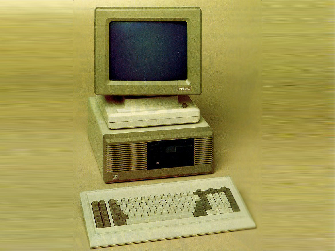
Photo of an ITT Xtra computer circa 1984

I have been using computers for over 35 years. This is quite a statement and one that makes me appreciate all the bad ergonomic decisions I’ve made along the way. In fact, it was a diagnosis of tendinitis in my elbow and subsequent introductory questions from a doctor that made me even realize that my relationship with computers had been going on so long.

“Do you use a computer for work?” Yes.

“How long have you been using a computer?” Uhhh, years? Decades? A long, long time.

And I didn’t really have an exact answer. Which got me thinking, because it seems like something one should know about oneself. I’m in the first generation when it comes to personal computers (which may lead to another longer post topic).

The ITT Xtra is the first one I ever really explored. My parents bought it one Christmas and I can still remember first seeing it set up on the kitchen table. No box, no wrapping paper, just sitting there like an alien. Now, to be fair, I had been using computers for some years before this — they were starting to show up at friend’s houses and my middle school had purchased a bunch of TRS-80s to stick in a science class.

But there’s a difference between “using” and “exploring”. It wasn’t until this showed up in my house that I was able to spend unlimited hours learning what it could (and couldn’t) do and by extension, what I could (and couldn’t) do with it. My siblings were too young to care much about it and my parents were too busy to learn it, so I became the default user for the house.

“Give ITT a round of applause for including clear, profusely illustrated documentation with the Xtra. This little extra touch is worth it’s weight in gold.”

Creative Computing, 1985

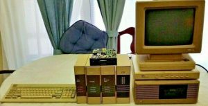
ITT Xtra computer with manuals and extra hard drive

Not an actual photo of my Xtra, but those manuals were fantastic!

It was that “profusely illustrated documentation,” as seen in the photo above, that gave me any chance of understanding how the computer worked. Beyond using the word processing program to write all my school papers, it was here that I began to make the early connection between code and art. The idea that you could program the computer to make art. This was an astonishingly profound revelation — that graphics on screen were directly tied to code — basically text. It wasn’t long, and it was probably the first thing I wanted to do with the computer, before I was writing screen graphics in BASIC.

Seeing the light

One of the coolest features was, of course, the amber monochrome monitor. While I may have had some initial trepidation because I had never heard of the ITT brand before, I was immediately won over when I learned that amber monochrome monitors were easier on the eyes than the traditional green monochrome monitors that everyone else had. Remember, I was a teenager with all the misguided fears, self-doubt and imagined peer pressure that accompanies those years, so having something — anything — uniquely cool was a big deal. Even if the claims about amber monitors weren’t necessarily true.

“An amber screen was claimed to give improved ergonomics, specifically by reducing eye strain; this claim appears to have little scientific basis.[3] However, the color amber is a softer light, and would be less disruptive to a user’s circadian rhythm.”

Wikipedia

So where does all this nostalgia lead us?

It’s led me to create a new page on the site using the style of my old original amber monochrome monitor. It’s a flashback to what it was like for me to work on that first ITT Xtra computer — amber, bitmap fonts on a black background. To that end, I’ve been toying with the idea of including a client archive page on the site. These two ideas were perfect for each other — a long list of text in a table with a retro design style.

The design itself is by it’s very nature, basic. I started by finding the perfect shade of amber, not necessarily in terms of accuracy, but more on an emotional basis dredged up from some sort of color memory library. Next up, was choosing the perfect bitmap font and I do love a good bitmap font. In this case, historical accuracy won over nostalgia as I was able to find the exact font files used on the ITT Xtra. From there, it was more of a matter of web development to bridge the gap between the old and new.

Now of course, it’s not an exact replica to the original, mostly due to the underlying technologies involved. The two big differences being the monitor construction and the text rendering engines in modern computers. Those old monochrome monitors made for much crisper text. So the way your laptop screen is built makes the text a little blurry (on the plus side, it has more than one color). The second difference is how your computer renders the text itself — usually via anti-aliasing or subpixel rendering. While I can’t overcome modern displays, I have included some CSS to help recreate that old text rendering.

Along the same lines, I’ve also chosen to use another old technique for the page — loading the client list data via XML and a deprecated Javascript library from Adobe called Spry. Now, admittedly, this has nothing to do with my old ITT Xtra, but it was a fun bit of nostalgia to use again. Old school web designers will fondly remember (or not) that thirteen years ago, loading data into a web page (without a database!) was super cool. At some point, I may swap this out for actual on page data which would be better for performance, accessibility and longevity.

In the meantime though, and without further ado, venture back in time to experience the dawn of personal computing.