Glamour

January 16, 2022

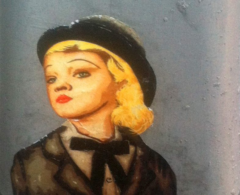
A glamorous paste up graphic of a blonde woman wearing a bowler hat and old style tuxedo

Another piece from the deep archives. This is a closeup of a wheat pasted cut out printed on the bottom of a traffic pole. Beyond the glamour of the colors, there’s a distinct attitude in the position of her head and in her eyes. A wariness perhaps as she seems to be turning away but not looking away. Wearing men’s clothes but with red lipstick, she captures (demands?) the masculine without relinquishing the feminine.

Brooklyn, NYC

The Door

January 8, 2022

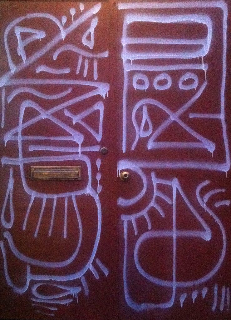
Red door with white spray paint pattern graffiti

Digging through the archives recently and I found this photo of a door from sometime in 2012. I love the minimal pattern, much of it single line, along with the loose flow of the lines. There’s a distinct improvised, on-the-spot feel to the piece.

Manhattan.

Ghost Dance

December 16, 2021

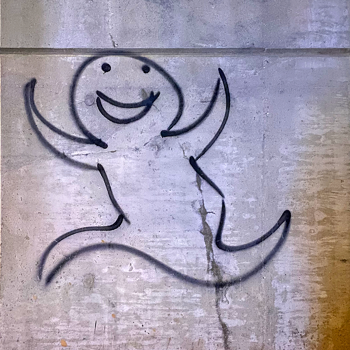
Spray paint graffiti of a smiling happy ghost skipping along in a single black line

Finally, made it back into the city and spotted this little gem. Confident line work with a great attitude and joy.

Soho, Manhattan.

War Sign

March 20, 2021

For a while now, as I’ve been working on symbols and icons, I’ve been thinking of opposites. The on/off icon switches we see throughout our digital lives. Am I on mute? Can you see my screen? These little yes/no binary icon changes to alert us in minuscule ways to our state of being. Each state is paired with it’s opposing force and we learn to recognize each as we build a library of shared acceptance. A common understanding if you will.

The concept of dualism as expressed by the yin and yang in ancient Chinese philosophy would say that each needs a counterpart in order to be whole. But there are symbols in our lives that do not seem to have an opposite and perhaps without both sides, we cannot have understanding. We’re only seeing one half of the picture.

This absence has always bugged me in particular around one symbol — the peace symbol. Now my annoyance probably has more to do with my nihilism and personal experiences than anything else. But coupled with a tendency to be a videogame completionist and being a designer, every time I see a peace sign, I wonder, where’s the war sign? Where’s the sign for those of us who see the dark?

Learning more about the origins of the peace symbol — probably via 99 Percent Invisible — finally gave me the push to create an opposing icon, a war sign to provide balance. Using the same flag semaphore base as the original, I’ve created a war sign.

war sign

The original peace sign uses the semaphore “N” and “D” for “nuclear disarmament” while this war sign uses the “N” and “W” for “nuclear war.” A grim thought, I know.

The peace sign was designed to express an element of despair while this war sign definitely has a more aggressive stance, even with the same “N” shape in place. Instead of drawing the eye down, it moves to the right and conjures an explosive element. It almost reminds me of the safety and hazard symbols used in science and transportation.

With the world at war for the last 20 years (or even longer depending on your framework) and the U.S. government continuing to keep the AUMF on the books so that it can declare war (without declaring war) any time it wants, we live in a time of war. Sadly, we need a symbol, a war sign. Perhaps with a symbol for both sides, we can gain an understanding of the whole and how each works in concert with the other.

Note: I’m certainly not promoting war. Don’t be silly. Quite the opposite in fact. I just think that denying war or keeping it invisible doesn’t work. Finally, despite a bit of intellectual meandering above, I’m realistic. This symbol will probably get used more by metal bands than anyone else. And I’m okay with that too.

You can download the war sign here.
Empire

March 13, 2021

With The Expanse in between seasons, we’ve gone back to the Star Wars franchise to get our science fiction fix. And while we work our way through The Mandalorian series, we pulled up Rogue One the other afternoon just to take a break from all the cuteness of baby Yoda. Nothing like a tragic tale of death and sacrifice to clear out the sinuses. Somewhere in the middle of the movie, I came across this symbol and headed down the rabbit hole of Star Wars art and iconography.

Now, ever since the early days, the franchise has had great art direction and a good set of icons — from the circular Empire symbol to the Rebel Alliance logo. Simple, recognizable and emotive. As a side effect, they’re easy to reproduce which has led to a ton of mommy blog crafting posts with customized merchandise.

Given all this, I was surprised when I saw this logo in the movie — one I can’t remember seeing before. In the mission on Eadu scene, the Empire science officers who are developing the Death Star are all wearing white jumpsuits with this logo patch on their upper arms.

Star Wars Rogue One Empire Science Officer Logo

For me, it’s the perfect symbol for the Death Star. It communicates the basic shape along with the firing mechanism. So I had to draw it up quick and you can download the icon here.


Toothpicks

February 27, 2021

Everyone is in a lot of calls these days. Phone calls, video calls, teams calls, zoom calls. We used to have meetings and now we have calls. The traditional way to stay alert (or to kill time) during a meeting, is to doodle. And for years, this was my preferred way to go through a meeting. I’m a prolific note taker, so doodling in the margins (or the whole page) was just another “note” in my mind. Like many designers, I’ve got notebooks full of doodles, some of which have revealed great ideas, cute illustrations or other worthy gems.

But now, my notes have shifted to text files, so there’s no more doodling. A sad side effect of never leaving my laptop behind for a meeting. In the before times, I’ve always preferred a hard copy notebook over any electronic device. It was a nod of respect to whoever was leading the meeting — sort of like leaving your smartphone face down (or never taking it out). It announces that I won’t be actively doing something else while I should be paying attention to the meeting. Maybe it’s generational.

So while I’m now no longer drawing in the margins, I’ve found myself — quite by accident — creating little mini sculptures during my meetings calls. After snacking on something at my desk, I end up chewing on a toothpick which acts as a kind of fidget spinner to distract part of my brain while I focus on design, coding or whatever is being said on the call. At some point, the toothpick will break and I’ll put the pieces down on the desk and start arranging them.

It all started innocently and unconsciously enough, but soon I was actively in the creative process and rearranging little pieces of wood again and again. It was really just an exploration of shapes and color in a sort of 2D/3D mix. I think the project has run it’s course and I’m done with these, but we’ll see how it goes. Maybe I should redraw the set? Here’s a video showing a bunch of the individual sculptures.


Note: No flies were hurt during the making of this film. The fly was not alive when I took the photo. I think it died of old age. I just found it’s corpse the integrated it into the sculpture.

Finally, I love toothpicks and could write an entire post about them, but let’s just leave it as: my favorite toothpicks are party picks.

Unsmilely

January 24, 2021

Unsmilely Icon Set

There’s a natural ebb and flow to projects. An initial burst of inspiration creating momentum that slowly fades as the hard work and all too often, the insecurity sets in. This is one of those projects.

Originally drawn in 2017, it’s hard to recall the exact source of inspiration, but in hindsight, they seem a reaction to both the political landscape at the time as well as the sugar saturation of skeuomorphism in the standard emoji world. Like in my symbology project, these are a study in the reduction of the extraneous to reveal the core.

I think the other goal, given their simplicity, was always to animate them. The only question, and this is where the project ebb started, was how to best create the animation. And so, what started out as an excuse to learn new software applications — a tedious task which sucked any joy out of the project via frustration — led to stagnation. It was only recently when my web work sparked the idea of animating these via CSS. Now, there was still a ton of learning to do with this CSS only approach, but at least I had a stronger foundation having done it before with small things and these icons are in essence, a gr0up of small things.

Here’s a quick video demo of the animation.


And for those more inclined, here’s a Codepen with all the HTML/CSS.

See the Pen
Unsmilely Icon #1
by strongest (@strongest)
on CodePen.

The full collection on Codepen is available here: https://codepen.io/collection/XjoBzV

Or download the complete set to get the images.